Modeling & Materials

Weekly Activity Template

Linko Vu map exploration quest


Module 2


Campus walkthrough

Design Challenge 1
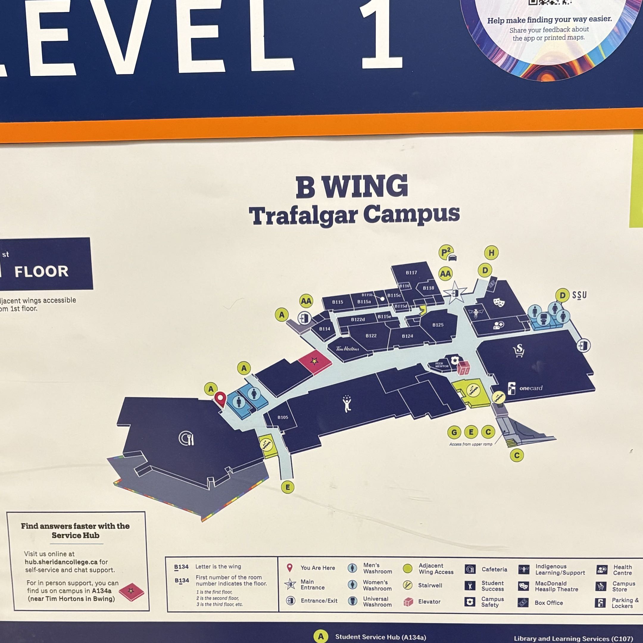
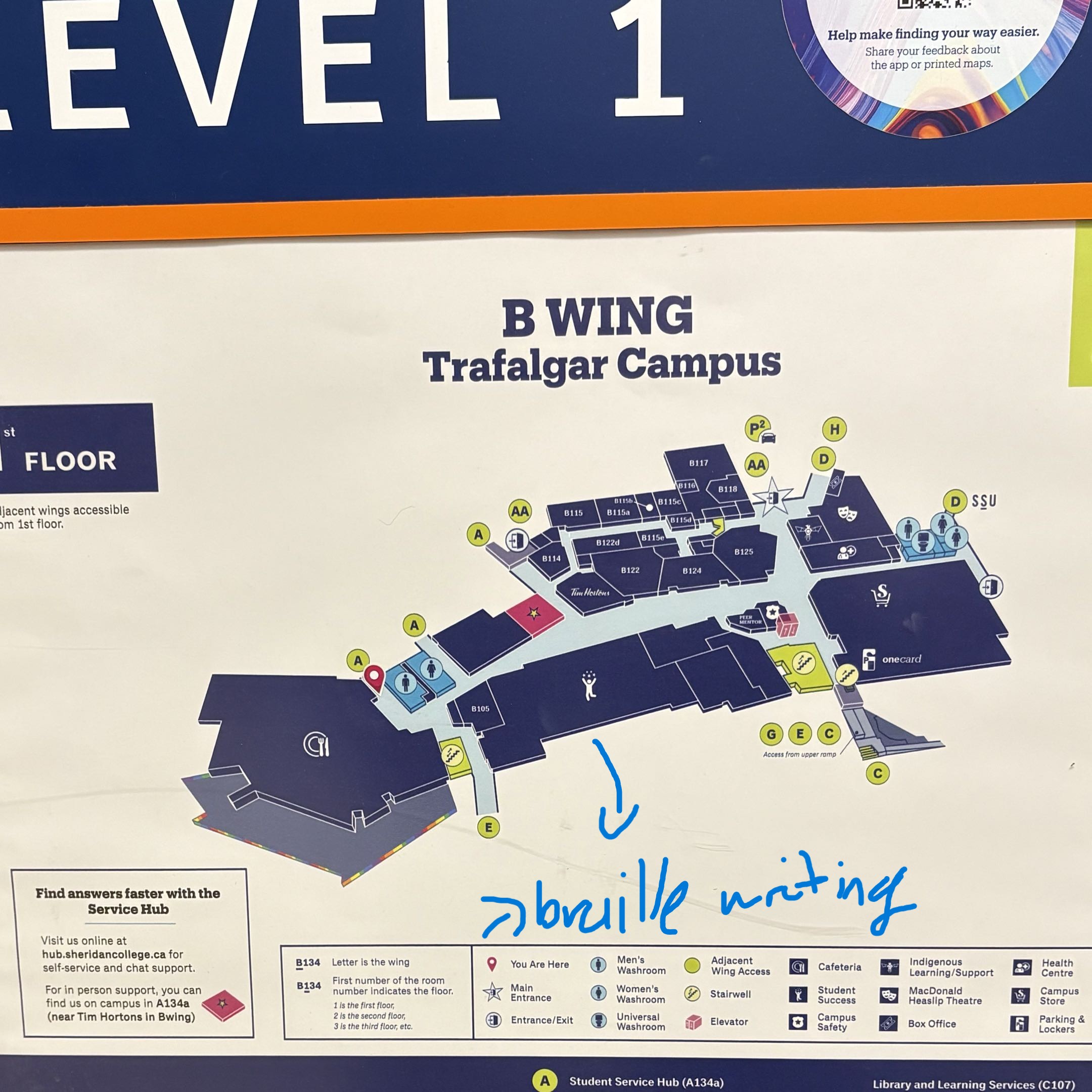
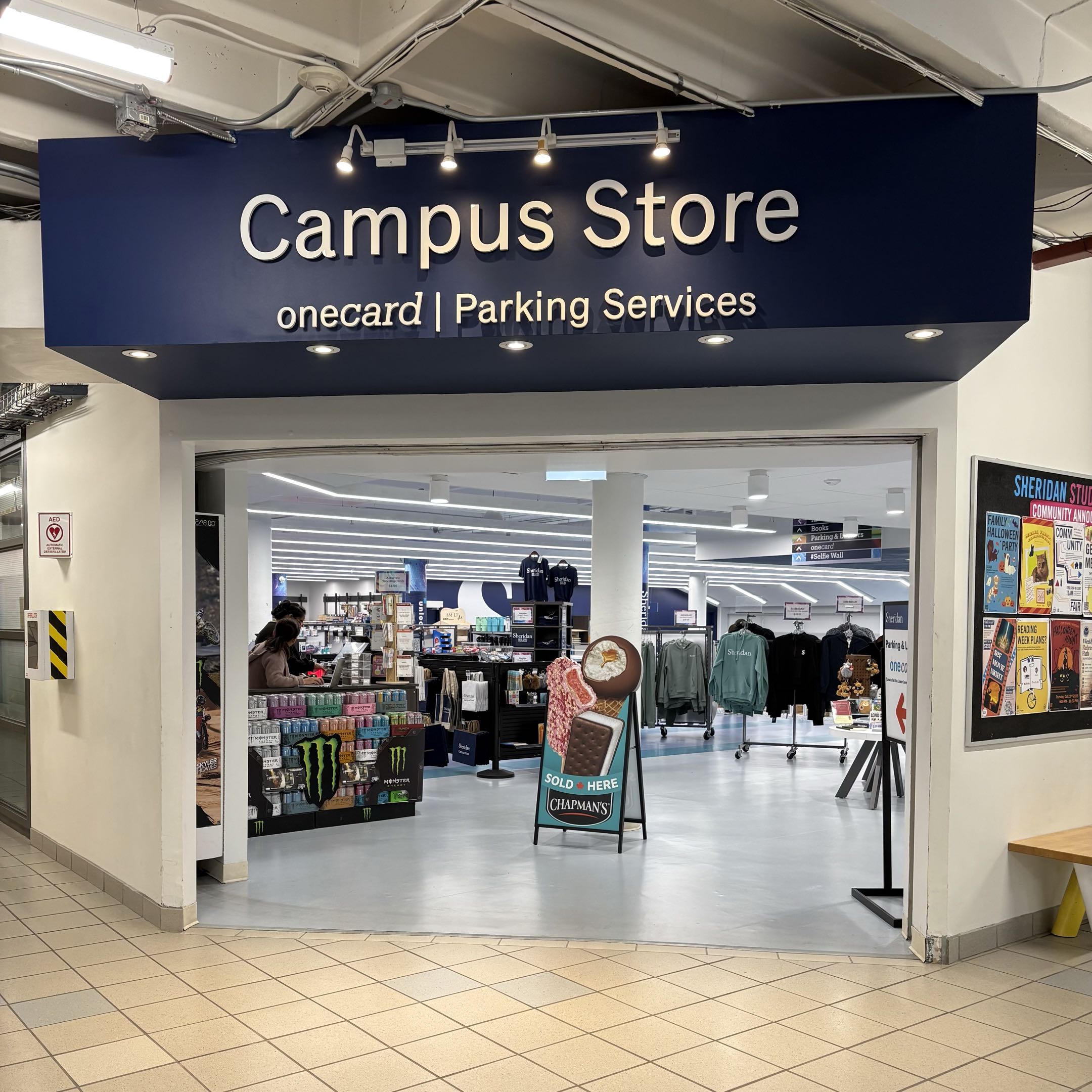
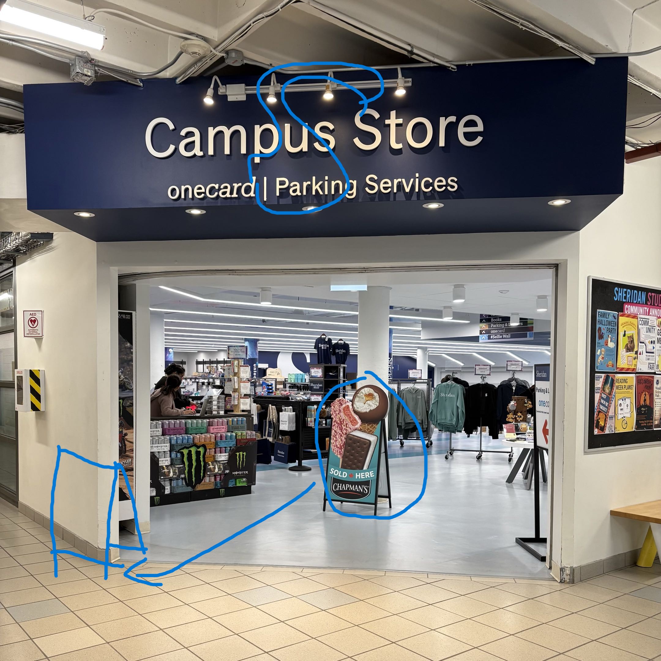
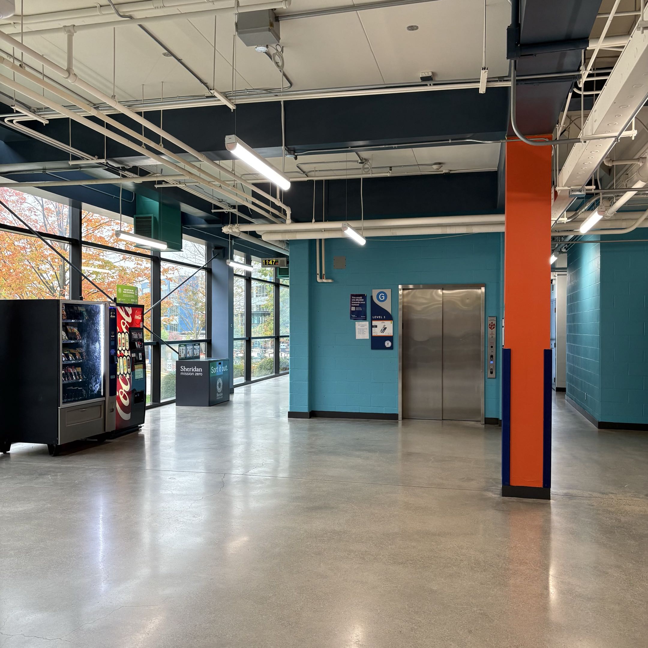
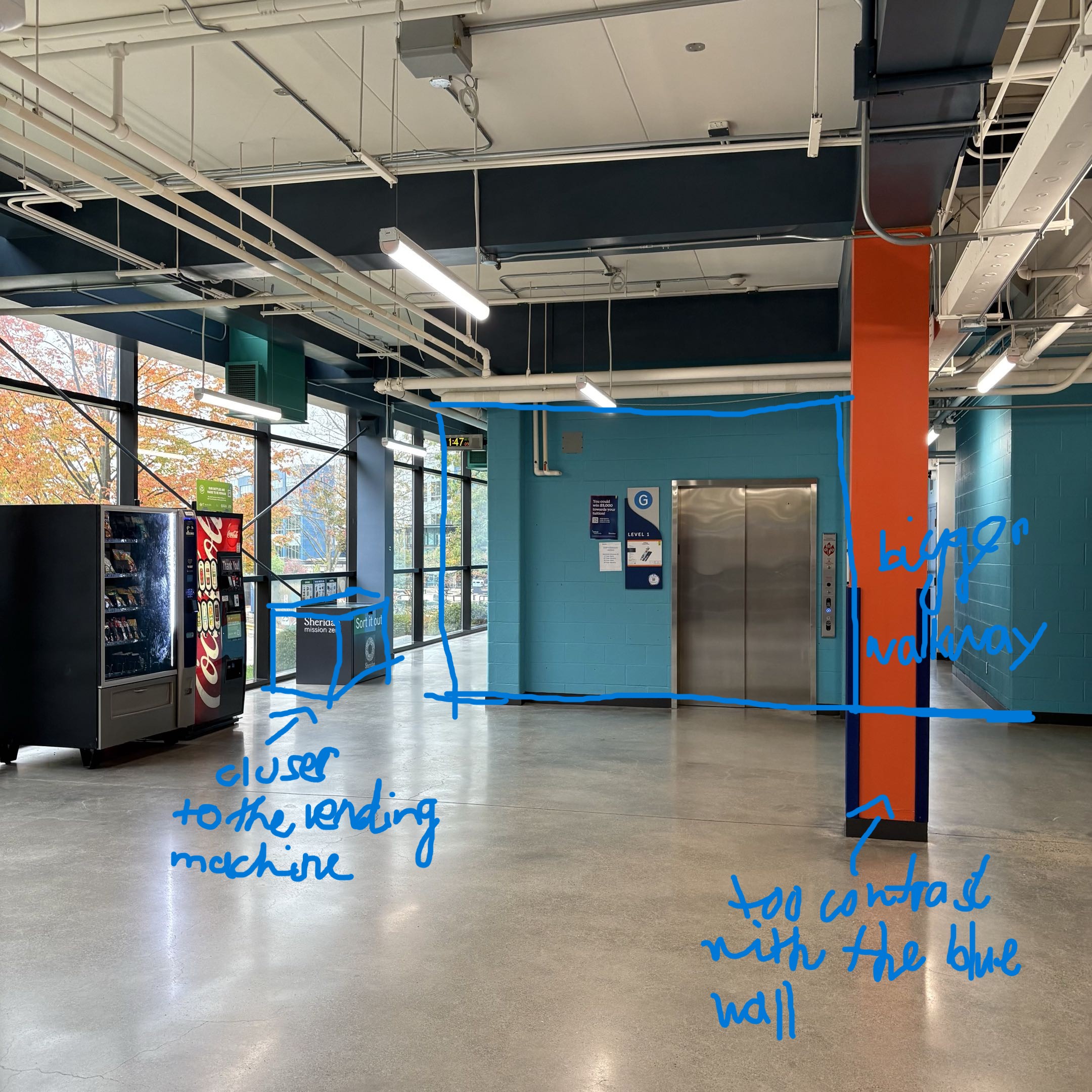
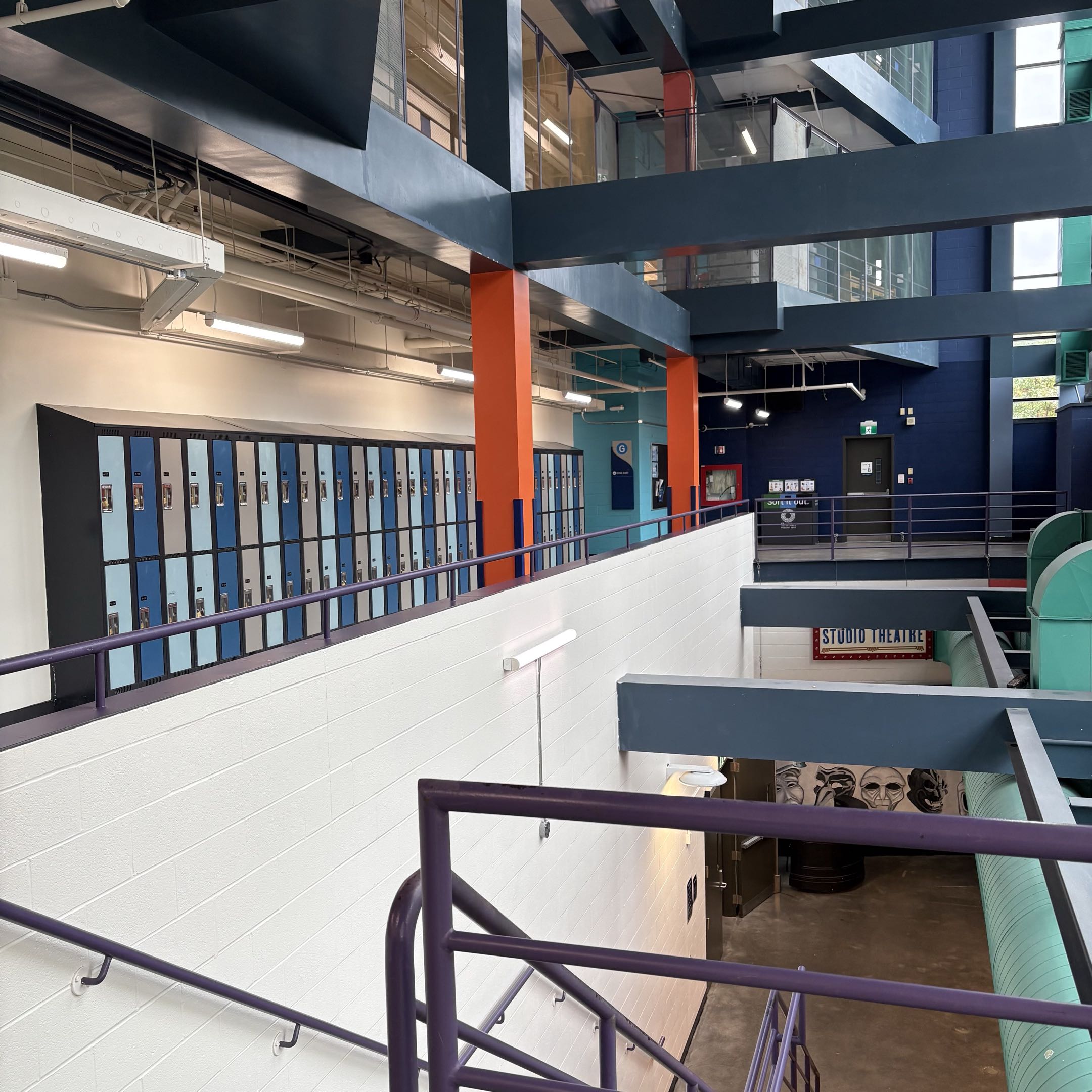
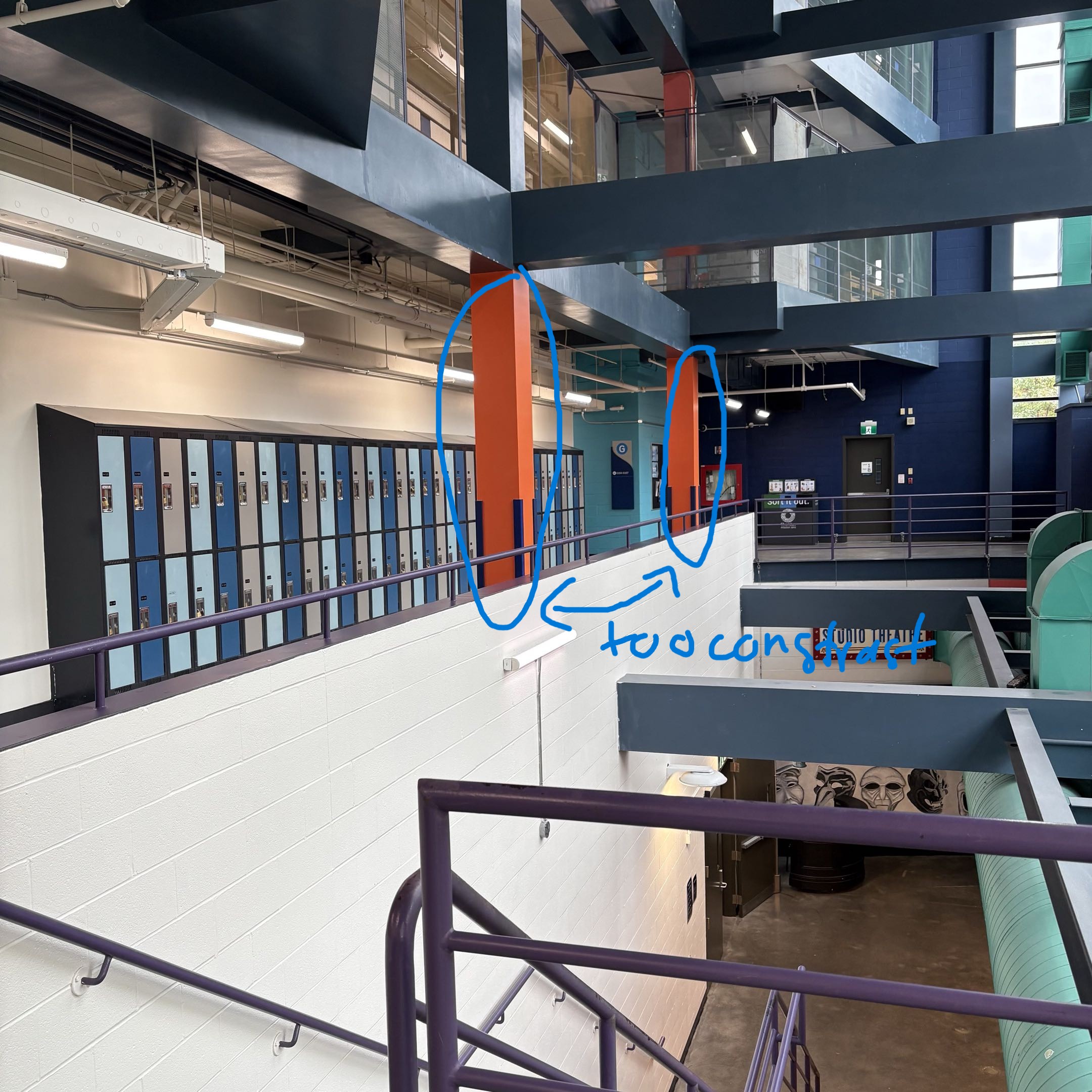
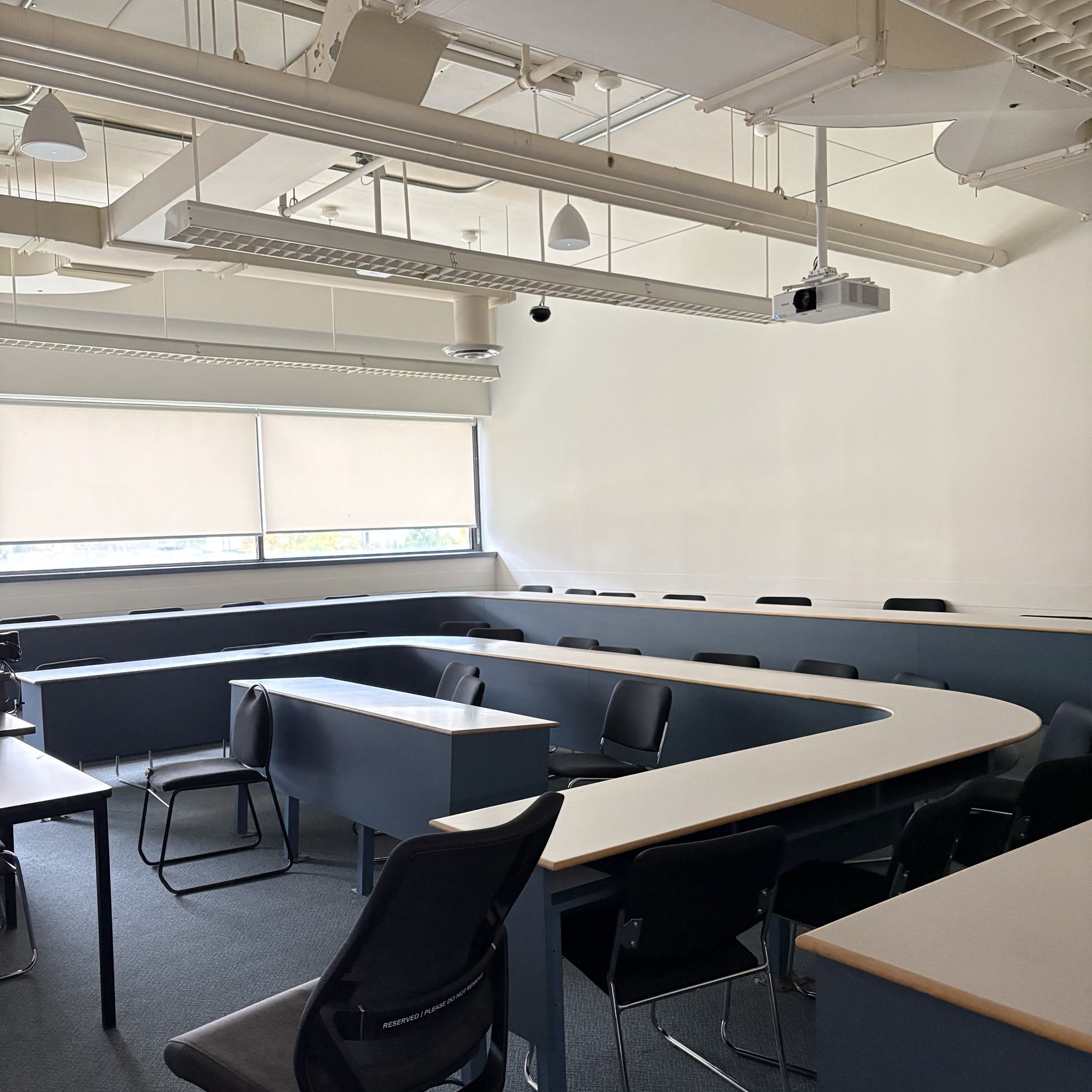
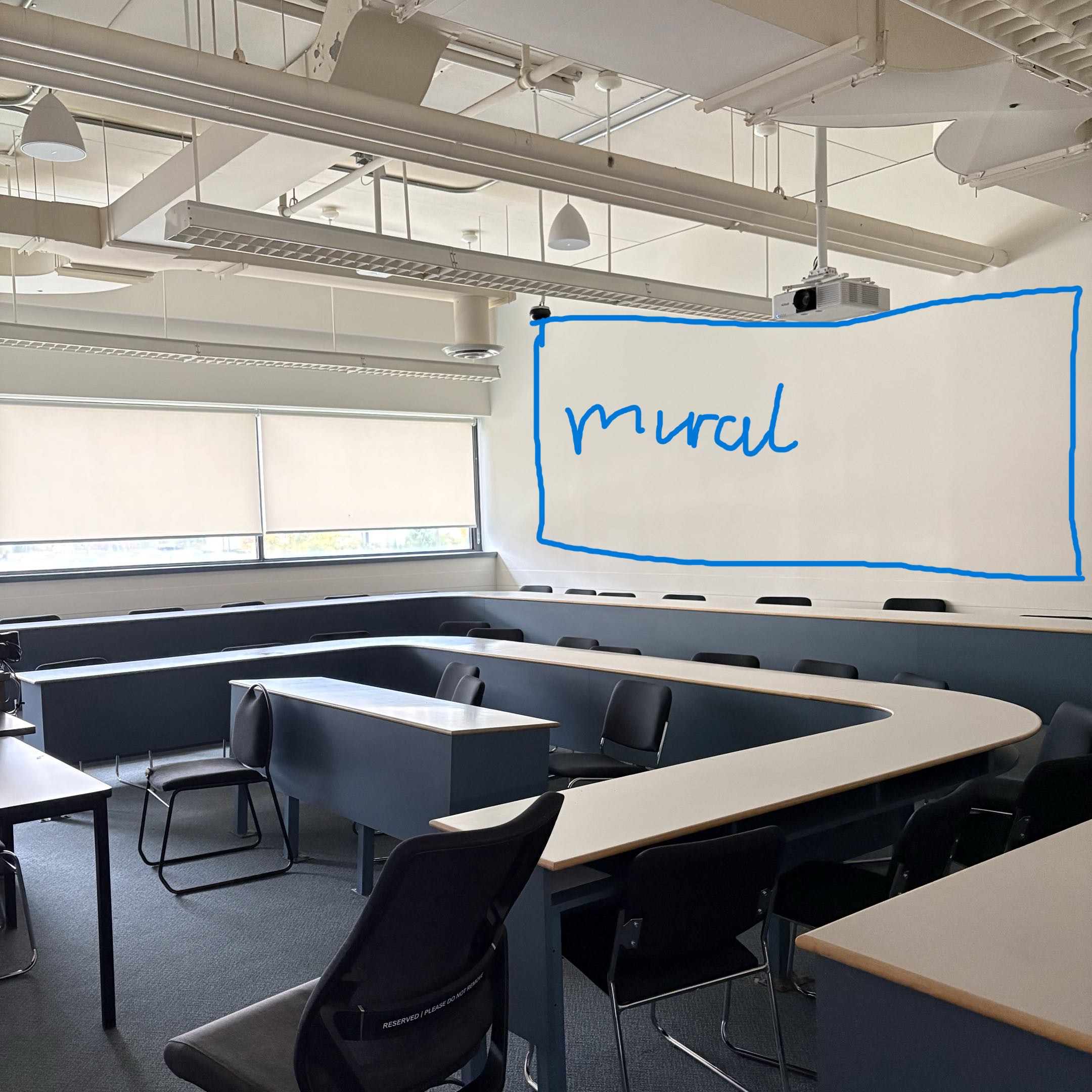
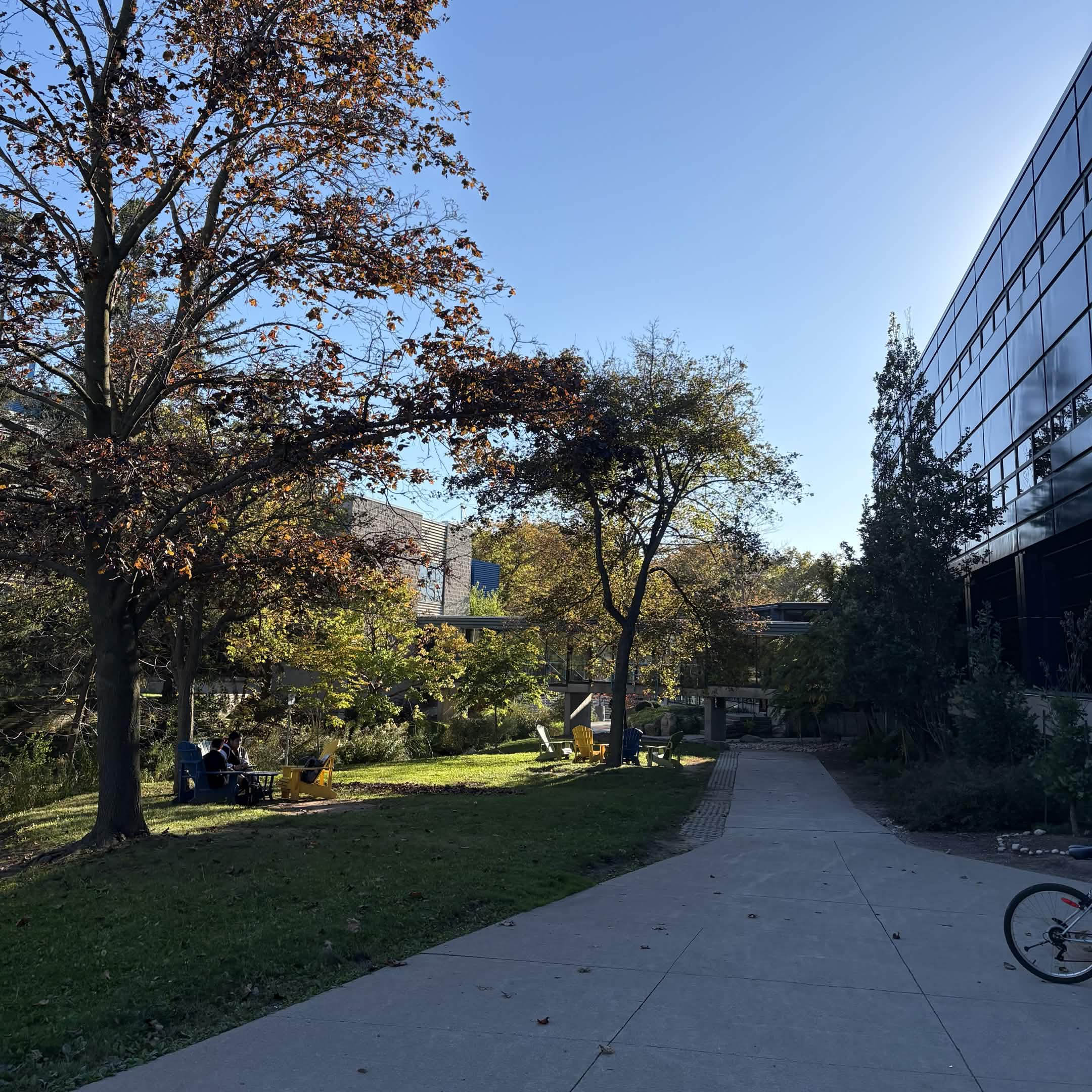
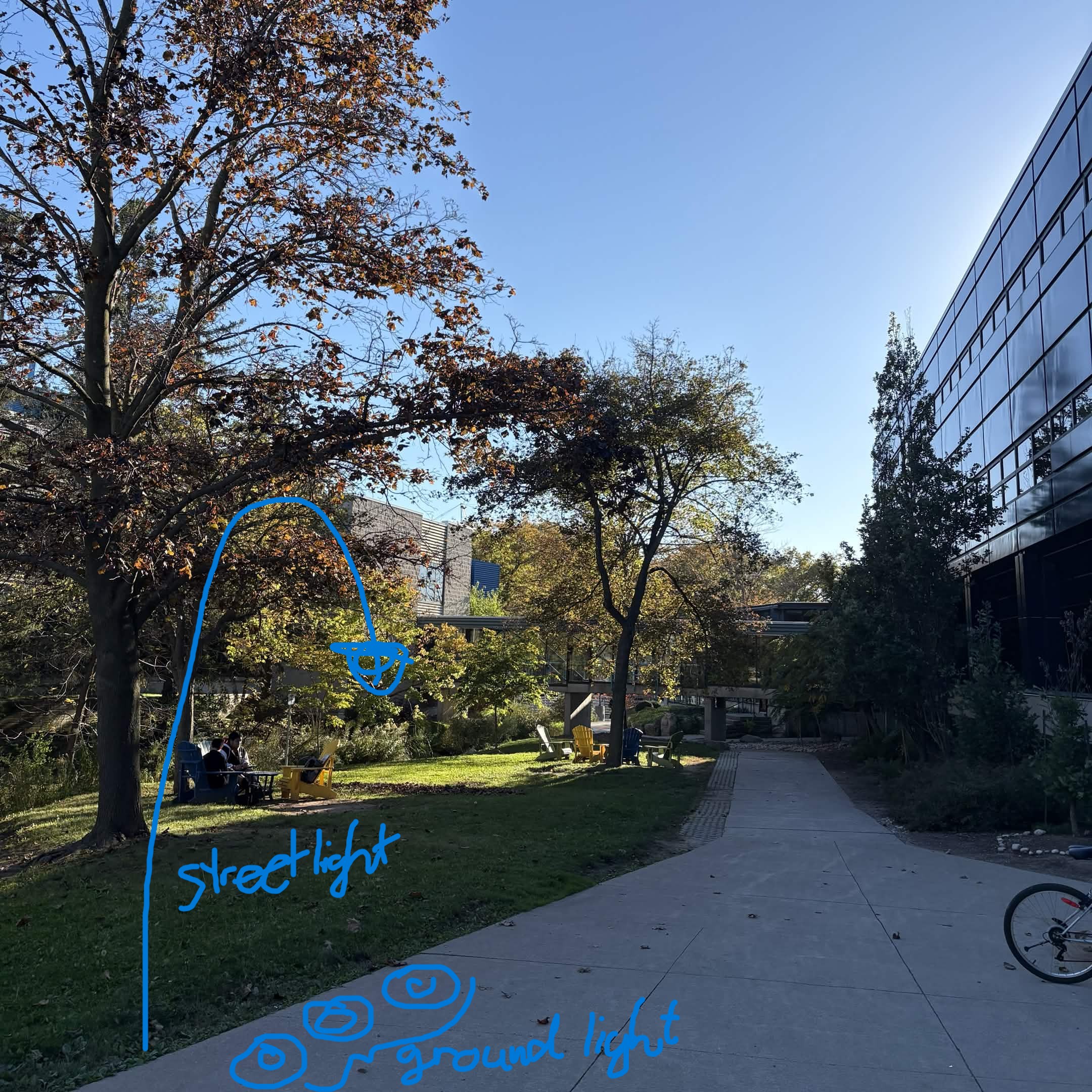
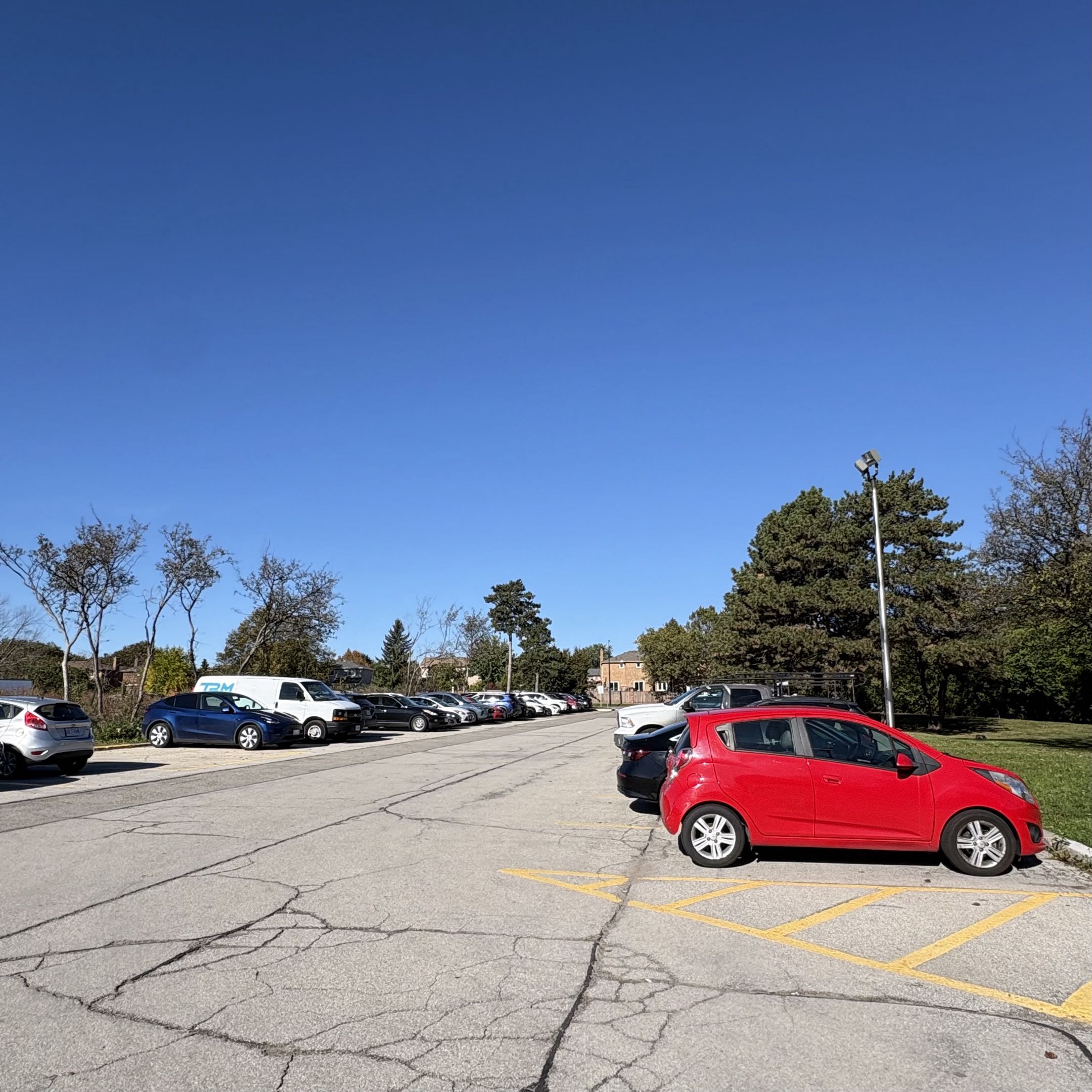
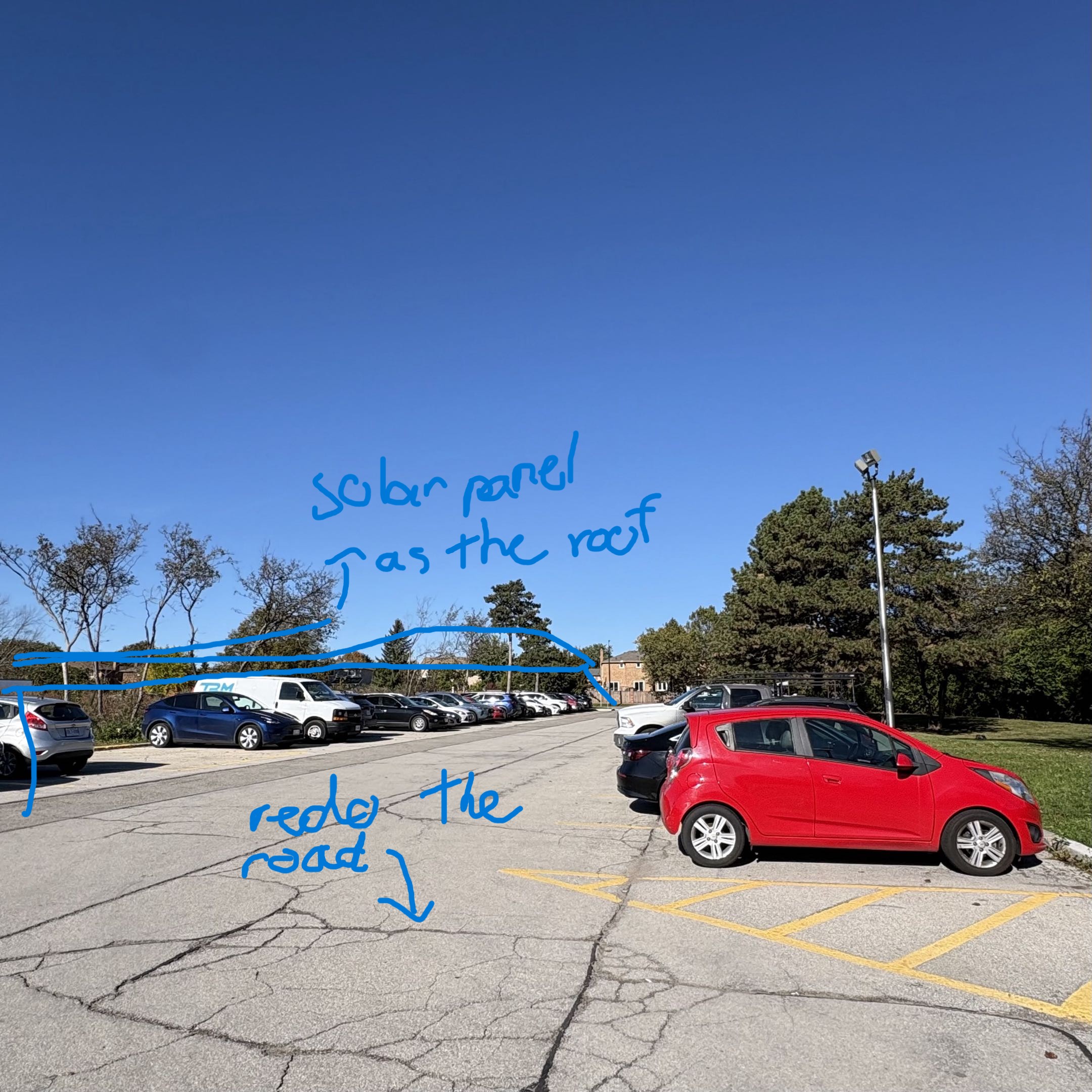
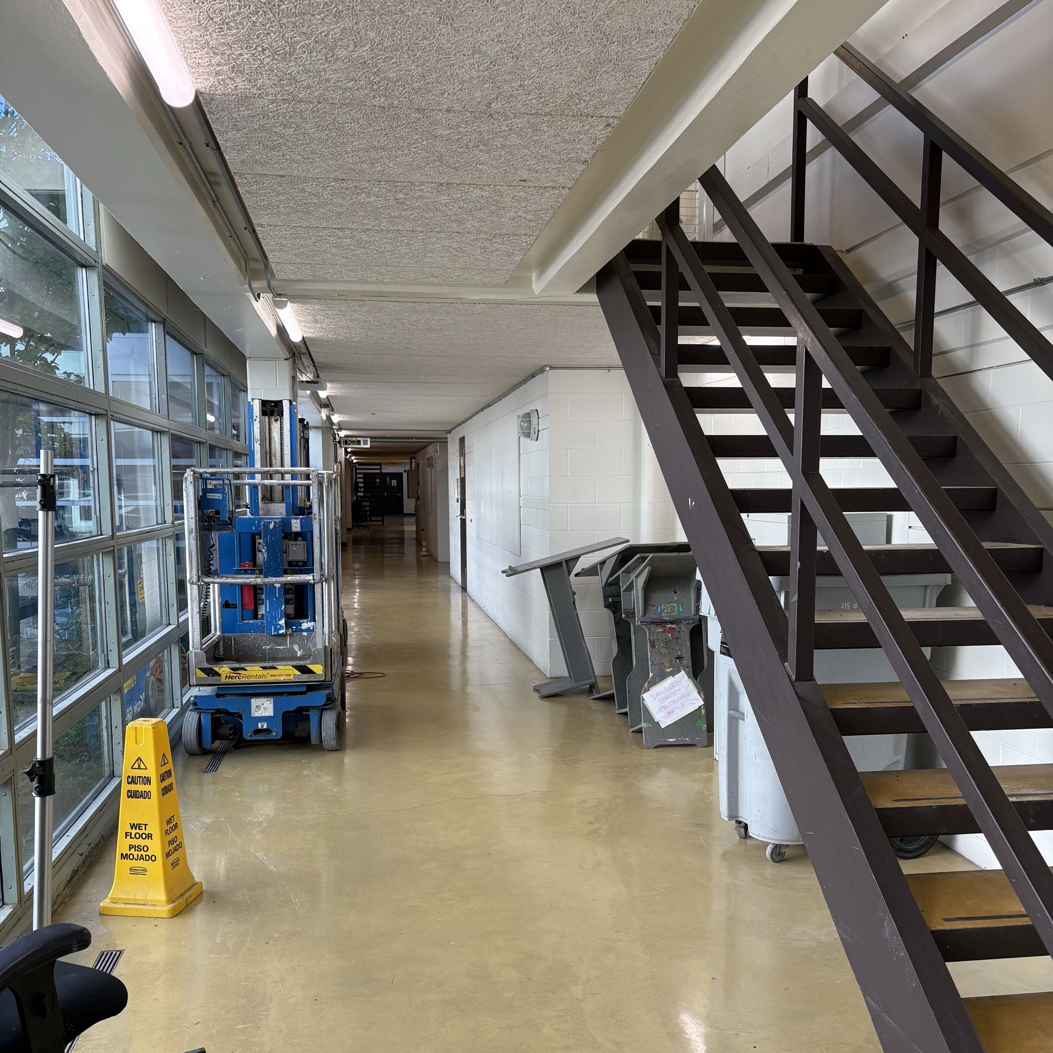
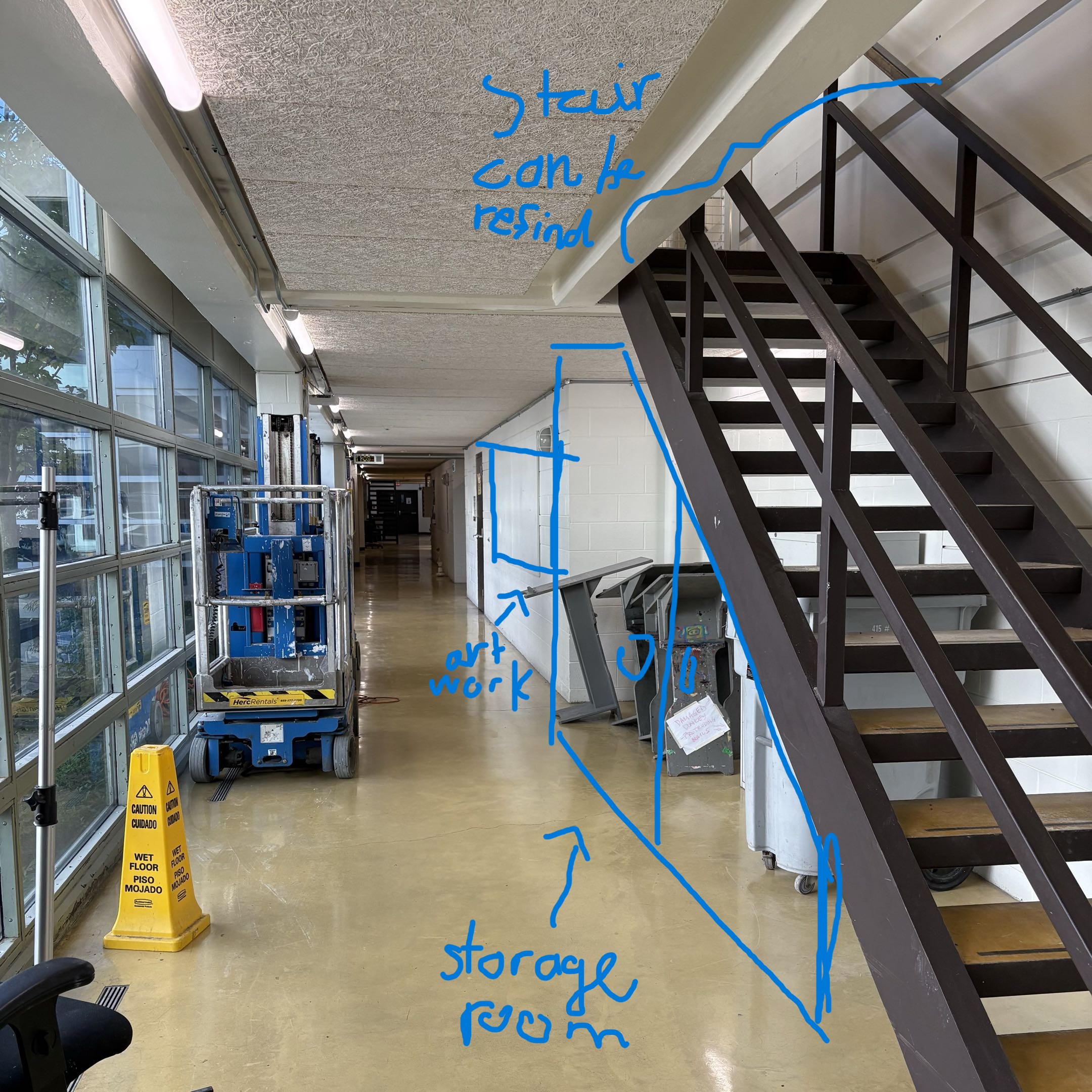
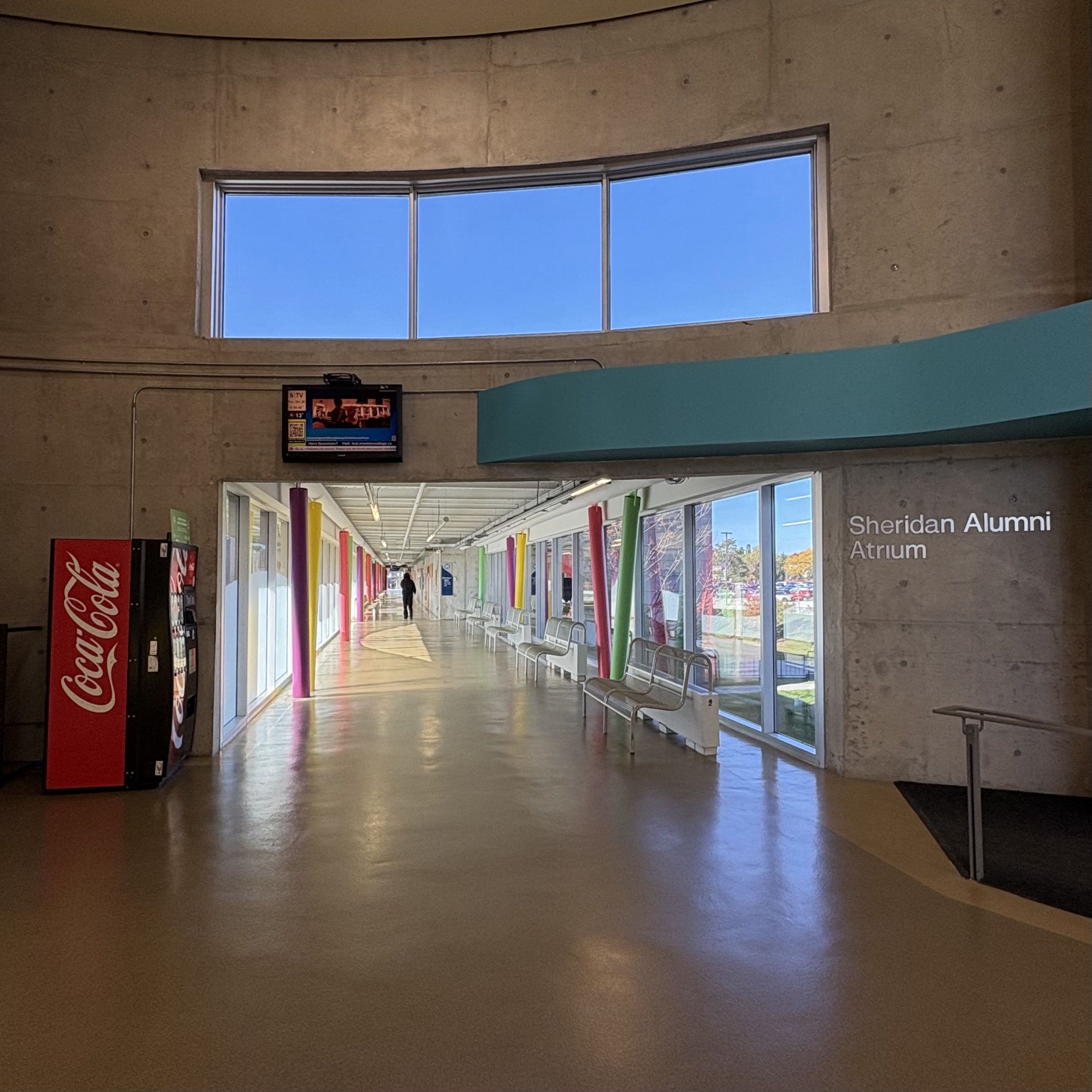
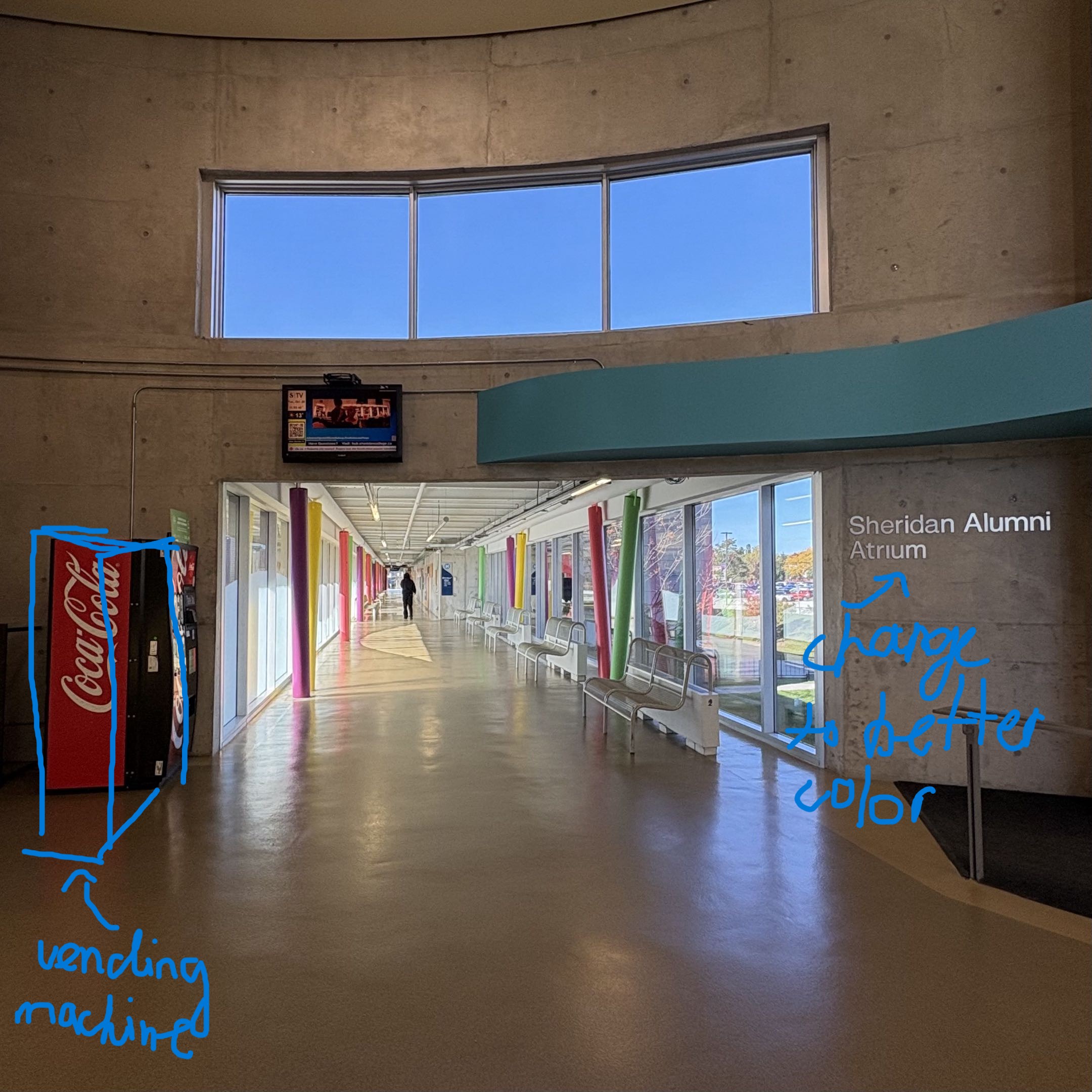
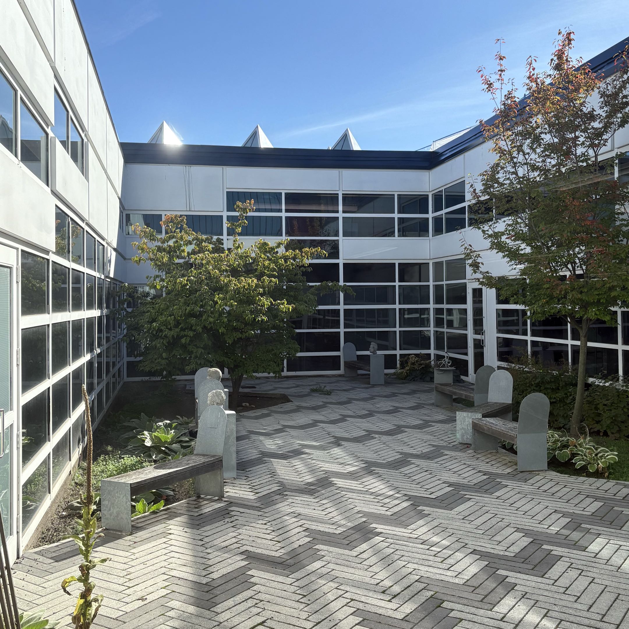
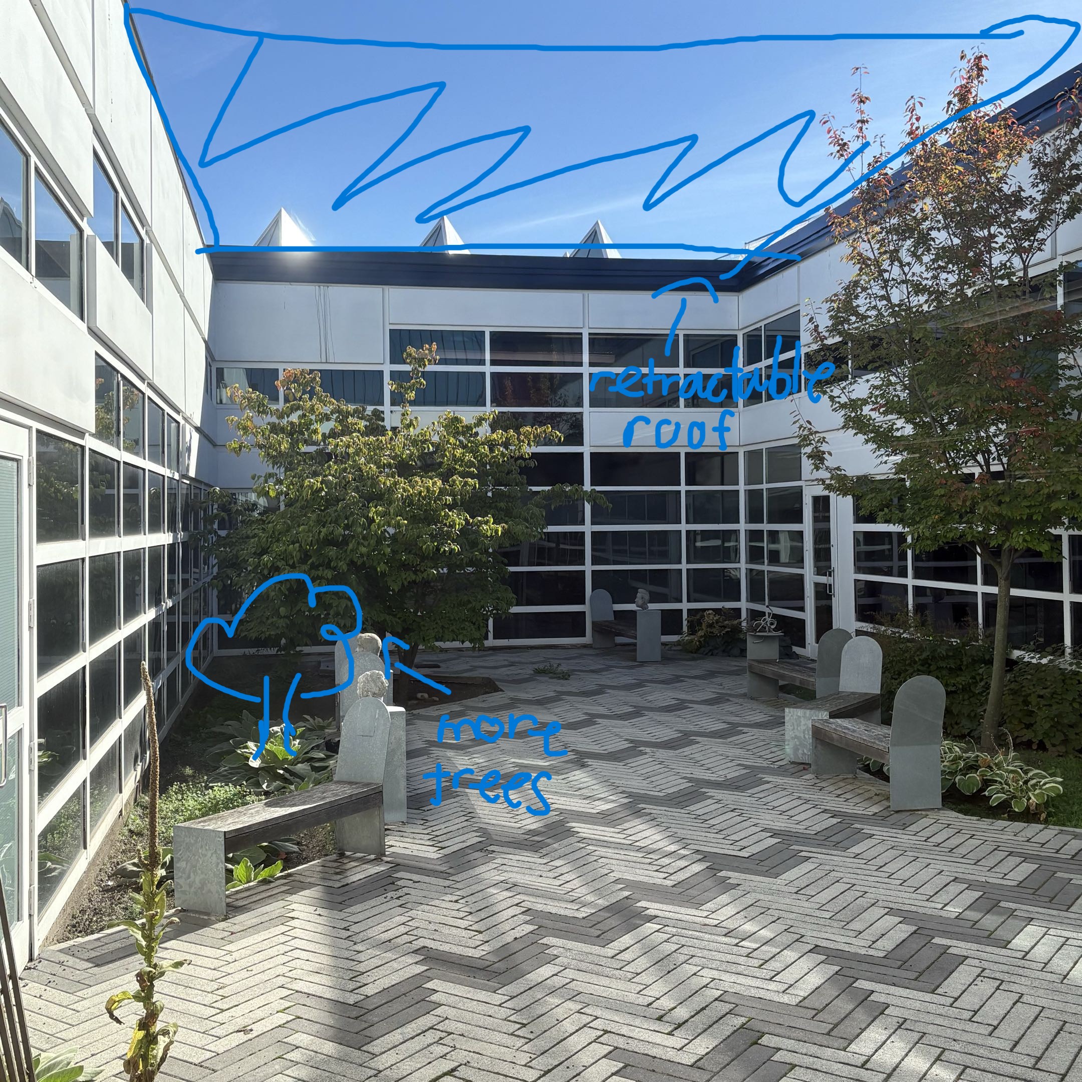
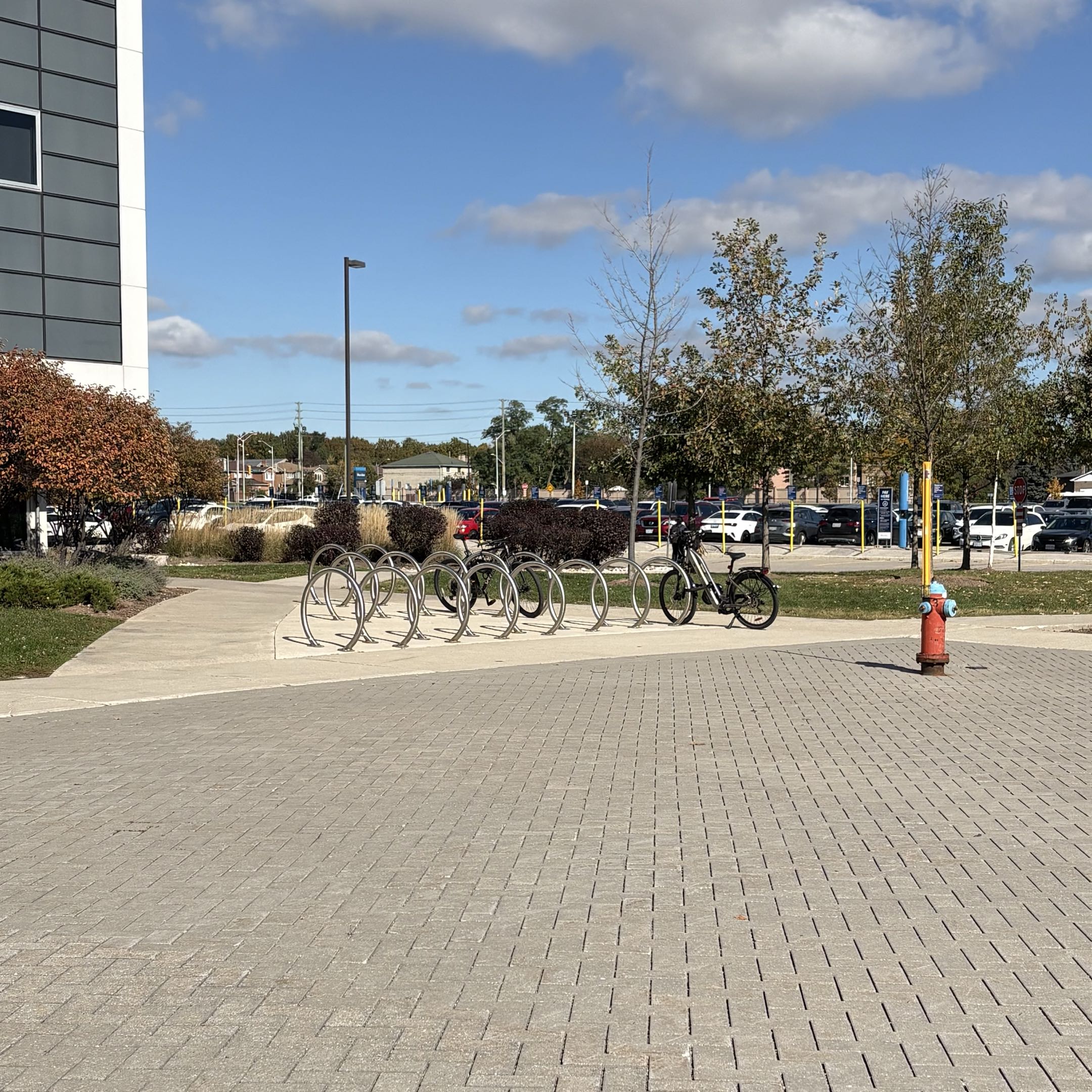
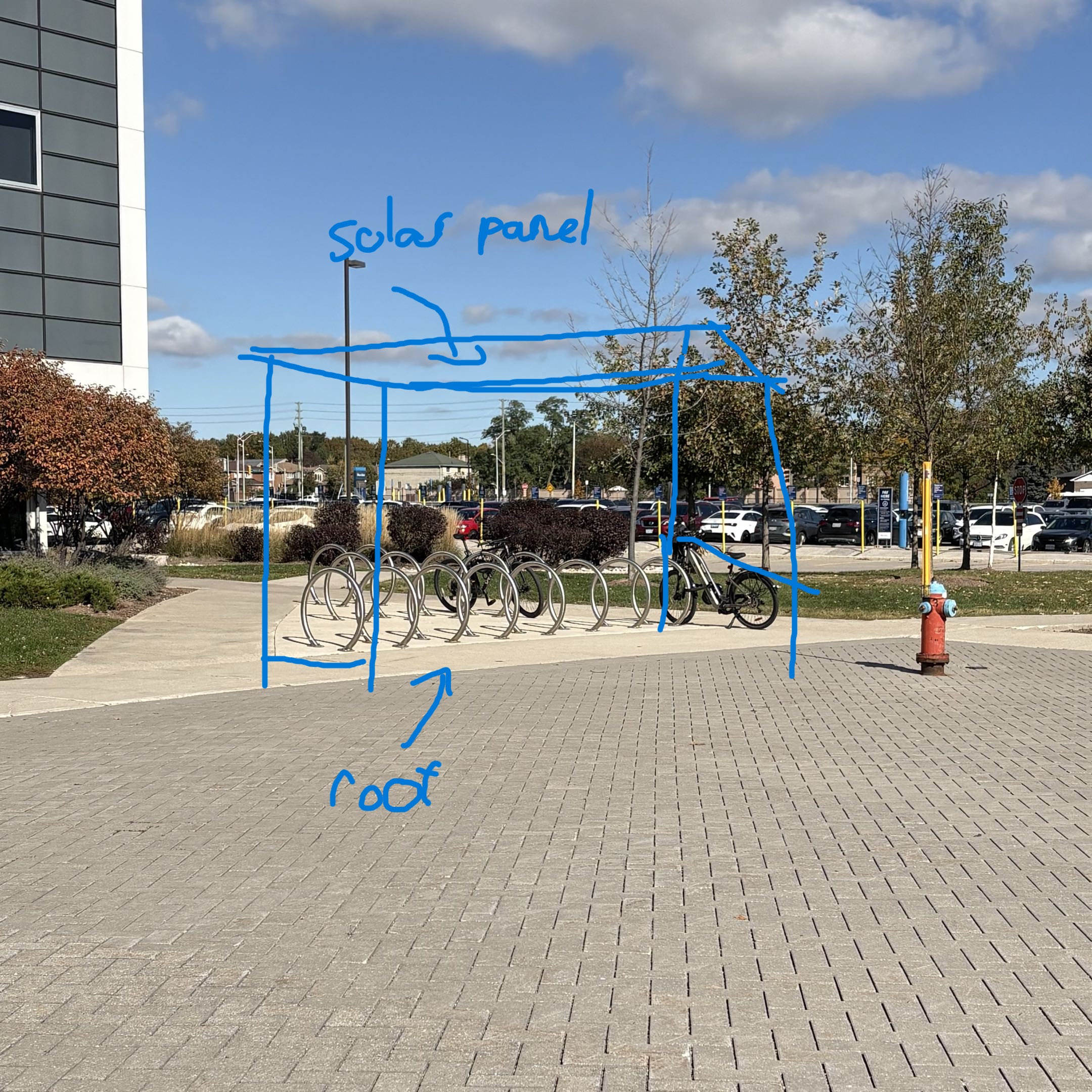
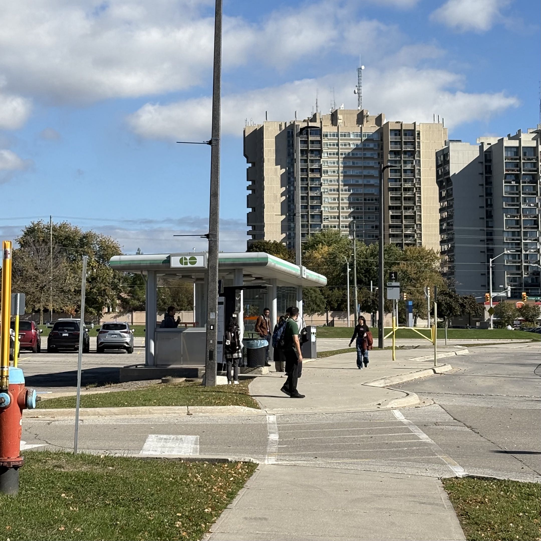
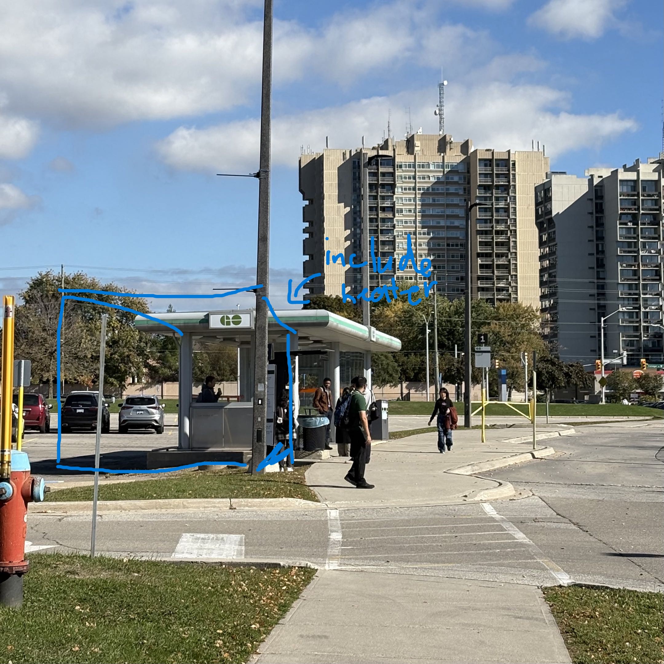
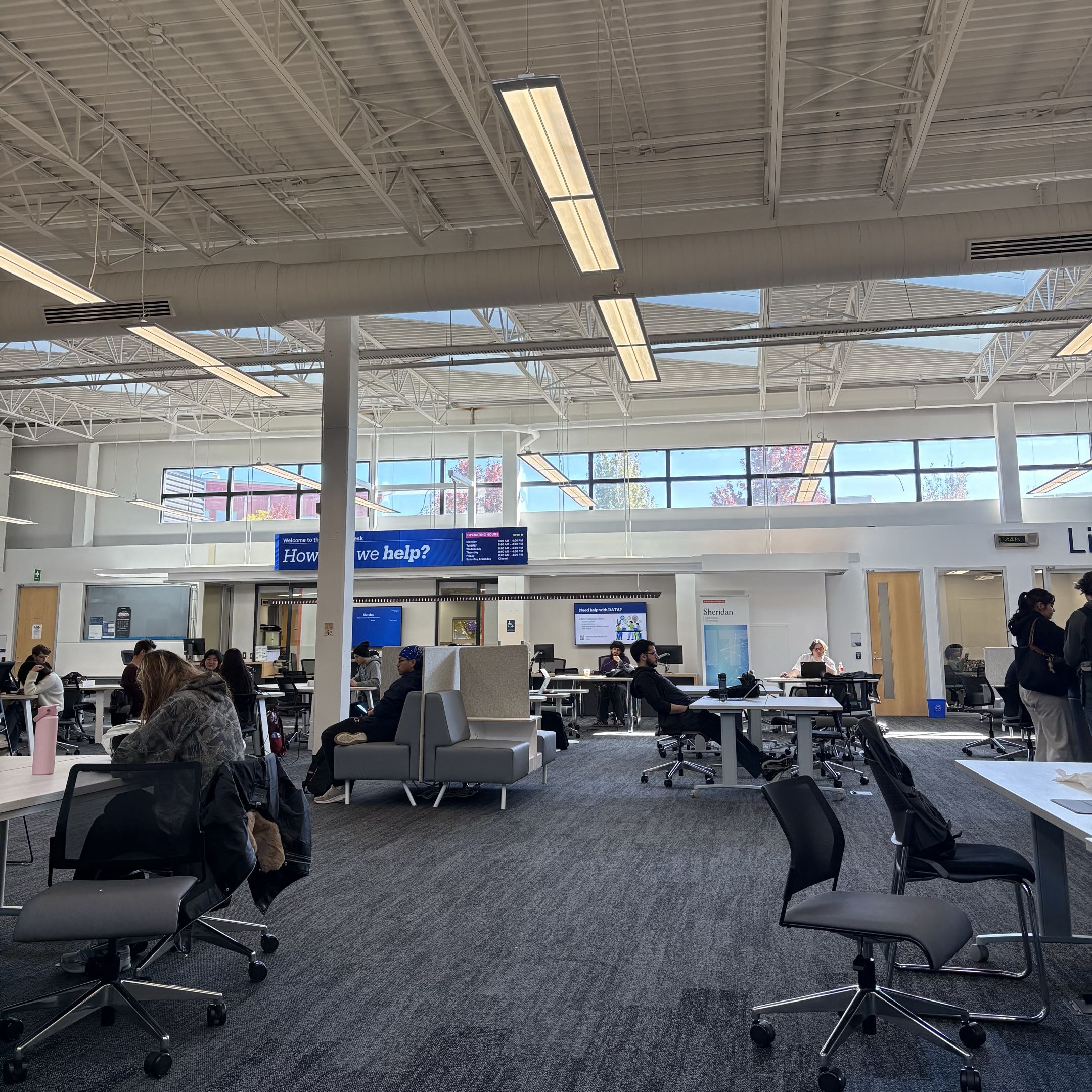
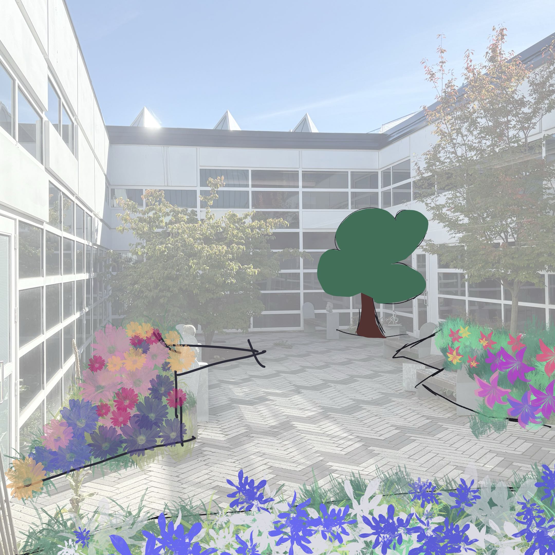
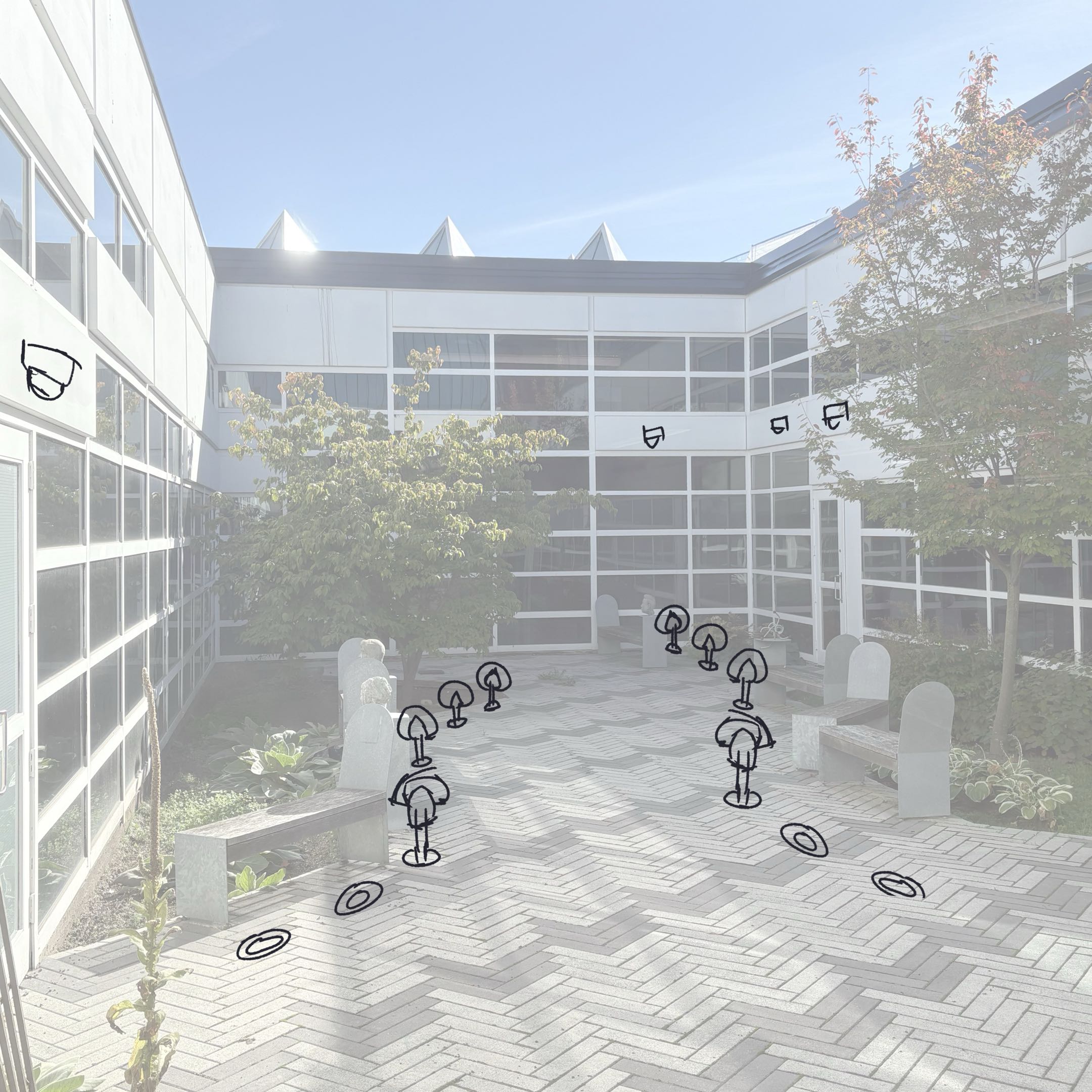
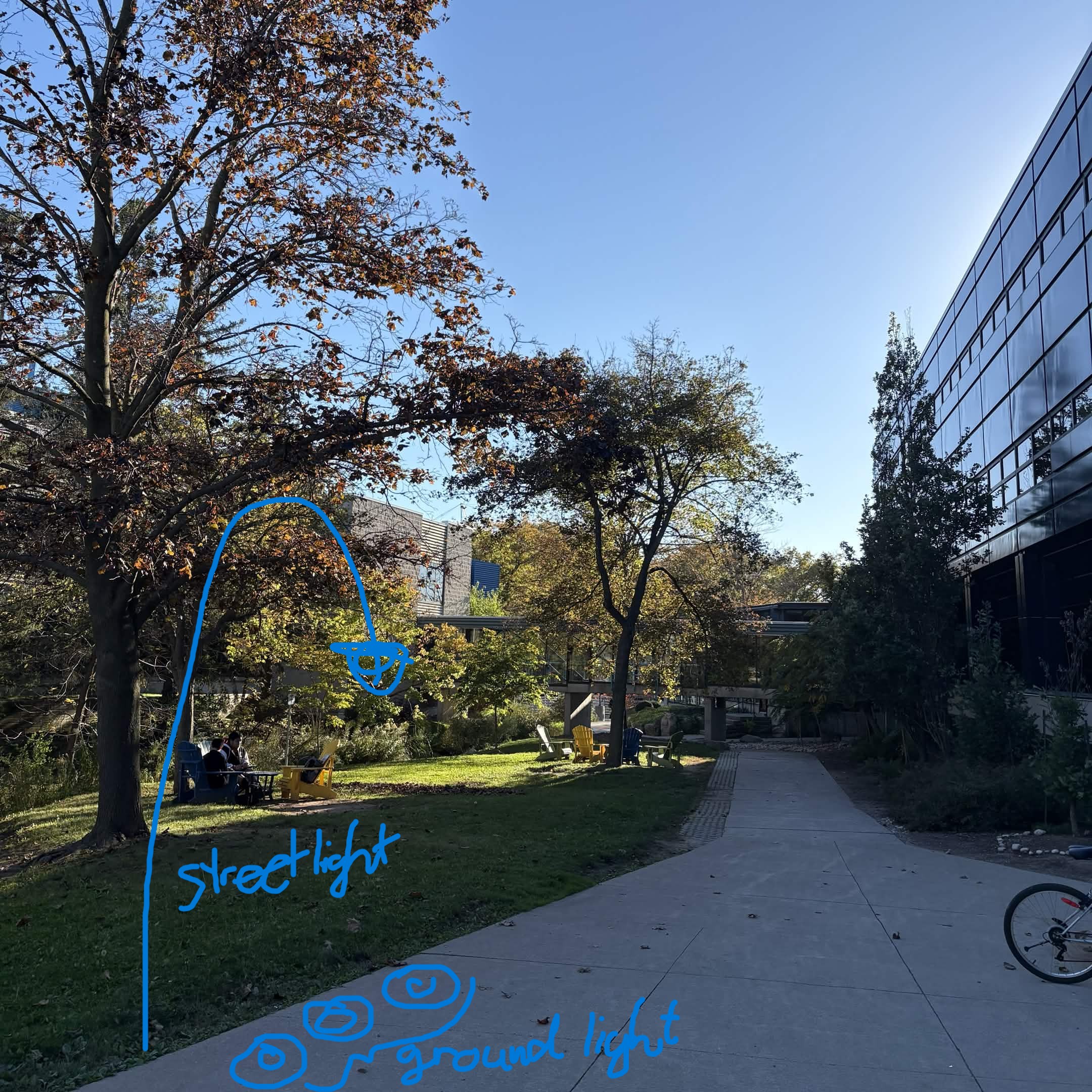
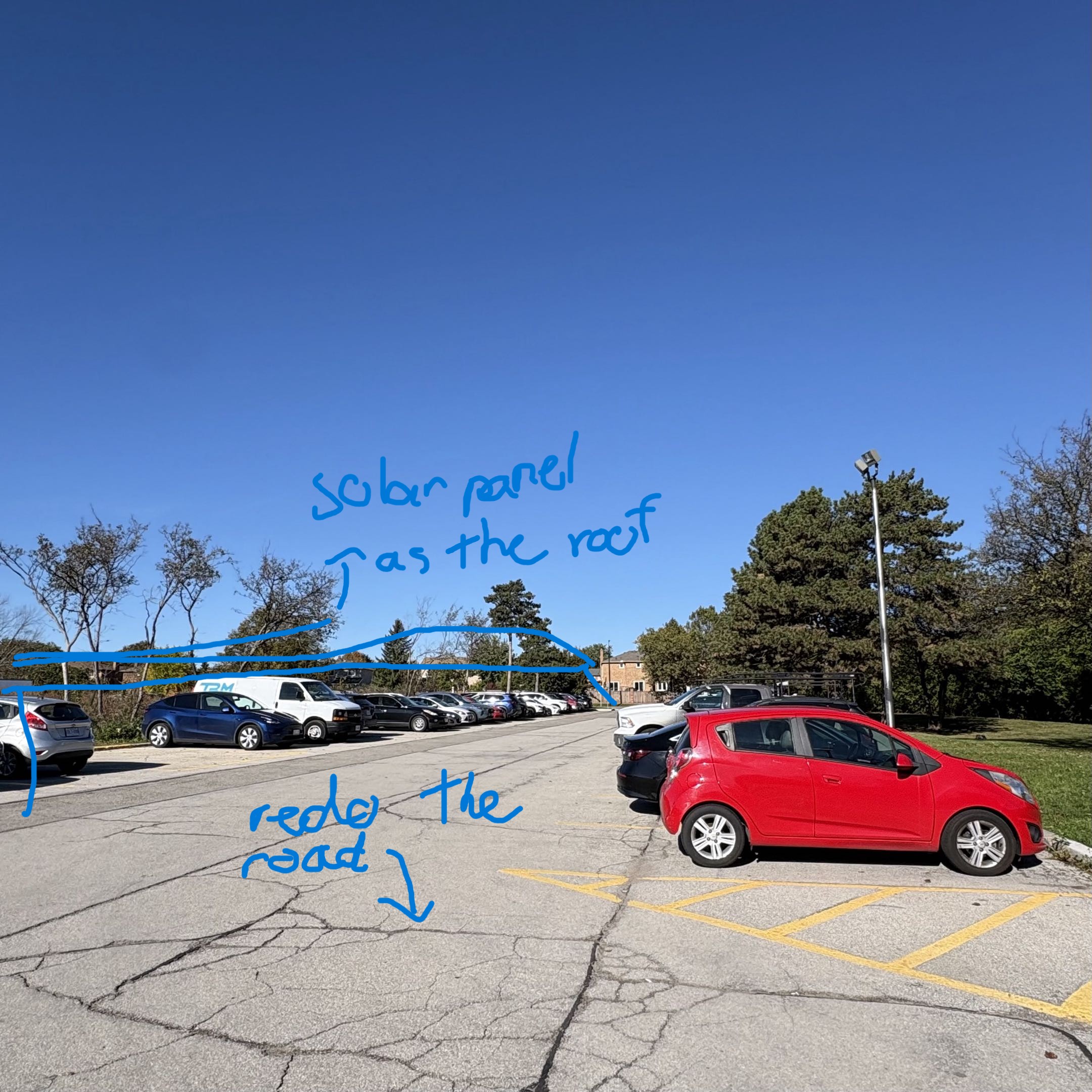
This is a B building map at Sheridan Trafalgar Campus. Simple and understand to use and able to figure out the way However, for blind or visual impaired people, they might having a hard time reading this. By adding a Braille language in both the map and the symbol, they will have an easier time figure it out The school's campus store. They sell many things inside, with higher price of course. However, the entrance looks to plain, let's decorate it, shall we? Personally, I would like to put the sandwich board at the entrance of the campus, so people can see whats new, and encourage them to go in. I also find the campus sign's too plain. By redesigning it by adding a S for Sheridan (if its not broke the signage rule), it might turns out nice and more unique Decide to go somewhere unique in the campus, so I went to the 'abandoned' G building. Although it looks old, it still a good place to pass by sometimes. For whatever reason, a building where you learn science related course have two pianos and a drum set. Should've add that at the J wing A few things I would like to improve here. The walkway betweem the elevator and two classroom should be bigger, in case of peoepl carrying stuff need to dodge people walking in a  different direction. The trashcan can be closer to the vending machines, but that optional. The two orange pilars should change the color, either to blue or something that is not complentary with blue Still at the G building, but this side have a stair to the basement. It's where you can see thearter kids. Pretty noisy down there too compare to the first floor This one have the same problem as the one I just point out at the previous photo: orange pilars. I don't hate orange, but it's too clash with the blue wall, would like it in a different color, such as dark green. This will make the space more harmony around, to make it more belong and being connected to people around One of the few classroom in the G building. Too bad the room with a piano and a drum set is occupied, so here's just a normal classroom. Also, if you look closely, the desk setup is look like a Wifi symbol: smallest desk, then medium, then the biggest at the back Don't have any complain about the room setup, because it just an average place for science and math related course. However, I found the back wall too empty, a simple mural at the back would make the classroom more welcome and colorful. Who knows the room might be use more often and no longer being an 'abandoned' place, create a welcoming and lively environment for students and staff to use, make the space more connected to people around The outdoor main pathway to walk into different buildings in the campus. Full of nature and outdoor place to sit. The sun is the paid actor in this photo, thank you sun The walking path might become dark to see if students walk during evening or late night. Having some sort of light, such as street light or ground light might improve visuality. This will make the students feel more safe and comfortable walking around the campus. The solution applied with the architectual theory, allowing the structure to help humans with their daily life School's parking lot, they have a lot so this is one of them located near the A building. You need to pay the fee for it, wish studeents and staff can park for free. Also this parking lot get one point for having trees around, so your car don't burned when park in the middle of the sun There are a few things you can improve the parking lot. YOu can build a solar panel on top of the parking lot. This will serve two purposes: block the car from the sun, rain, snow and create eletric from the sun. Another one, which is pretty obvious, is the road is cracked, sould fix it before snow coming This design bring many positive impact to the students, staff, and the place, create a cohesive and welcoming environment that also improve the nature around the campus One of the few hallway part of Animation classroom. Just pass by here to grab some food at the B building. But the atmosphere feel like a storage room more than Animation hallway. Well, let fix things up then I saw the stair, and thinking they should refind it and make it look more beautiful. Another thing is they can make a storage room below the stair, might not able to fit all the stuff, but at least it can keep the hallway looks more spacious. The wall can be painted with a mural painted by students, so it will encourage students to do more work and show their work to the public. This will make the landscape from a boring, messy hallway that looks like a storage room, to a lively, colorful hallway that encourage students to do more work and show their work to the public Since I walk around the school today (not for the photo purpose of course), so here's the one connect the J and H wing. Look very spacious and a lot of sunshine. This is how you regonized that you in the IXD department The hallway looks good already, but there are some suggestions. A snack vending machine next to the drink one would be useful, so people can just go grab some snacks then back to class without go to the B wing or the Marquee. The sign 'Sheridan Alumni Atrium' sign should be a different color, such as the dark blue from the Sheridan sign, so it will pop out more instead of the same color of the wall I don't know what this place called (I assumed its also part of Animation faculty), so I guess it's a backyard for Animation students to go outside and draw. might serve when they study about lighting. The backyard look too plain for me, so there can be some improvment for this First things first, more trees, bushes and grass. it would make the place more lively. Secondly, a rectractable roof would work very well here, in case the students suppose to have an outdoor lesson but it's raining, or sudden snow, so the students and staff won't get wet. It also might become another environment place for students to hangout and study, make it more welcoming and lively, which more human connection with the space One of the few bike parking around the school. This one is near the J wing A ptretty nice bike parking, it would be nice if it's have a roof so that it can prevent the bike getting wet when it's rain. The top part of the roof can be a solar panel, create electricity.The architectual theory applied here, allowing the roof structure to help humans with their daily life. The roof can be a retractable one, so when it's sunny, the roof can be open, and when it's raining or snowing, the roof can be closed A GO bus station. many students going to school via bus. Glad they have an indoor waiting area, would be nice to have something to improve at this place The indoor area can be larger, so in case it's raining or snowing, students have a shelter to wait. A heater inside the station would also be nice, especinally during winter time, so no one will get a cold. Learning commons, where students go to doing their own work or a place to hangout. Full of sunlight shine through the windows and have enough light, tables, chairs, and PC for students to doing working comfortably. There aren't anything to improve at this area

Design Challenge 2
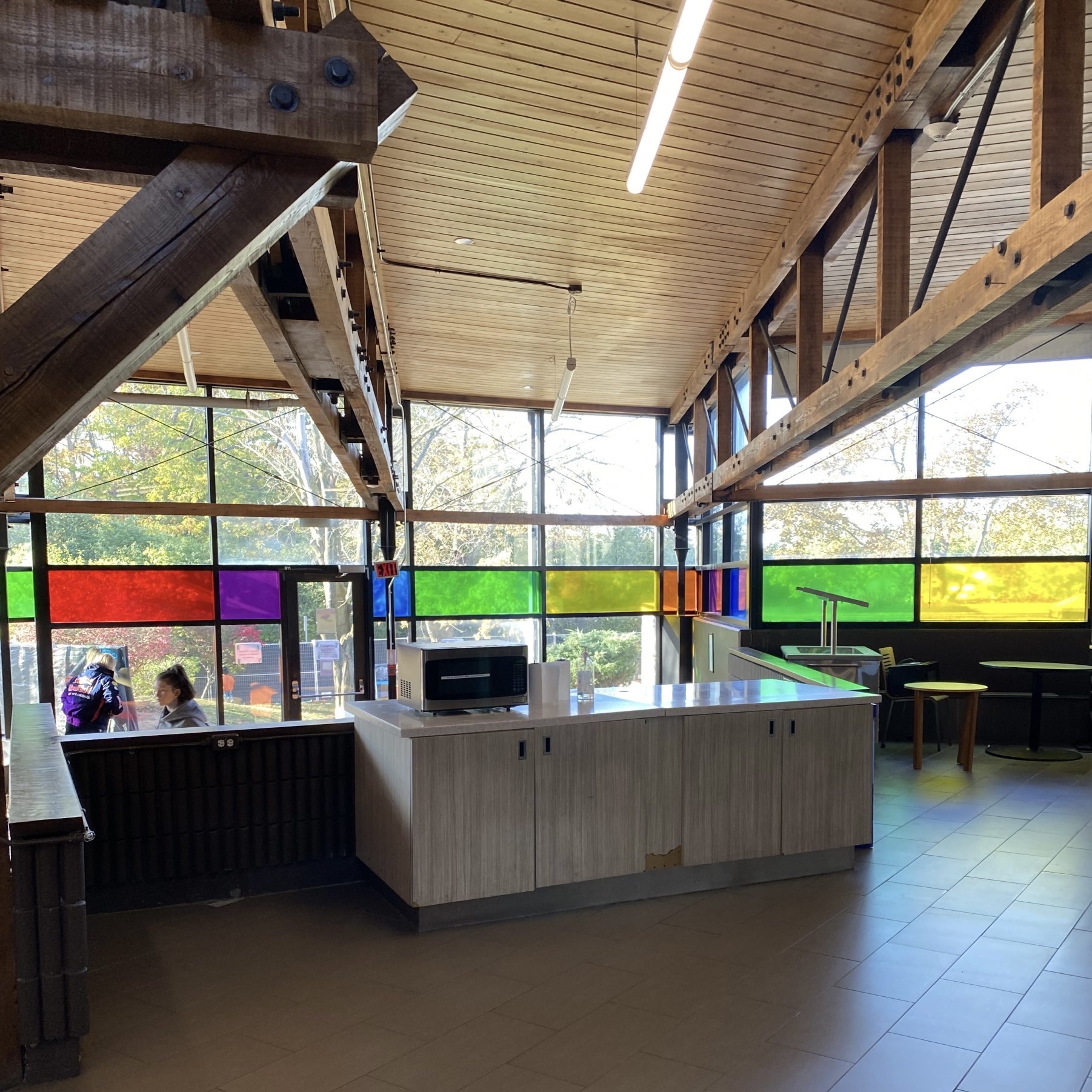
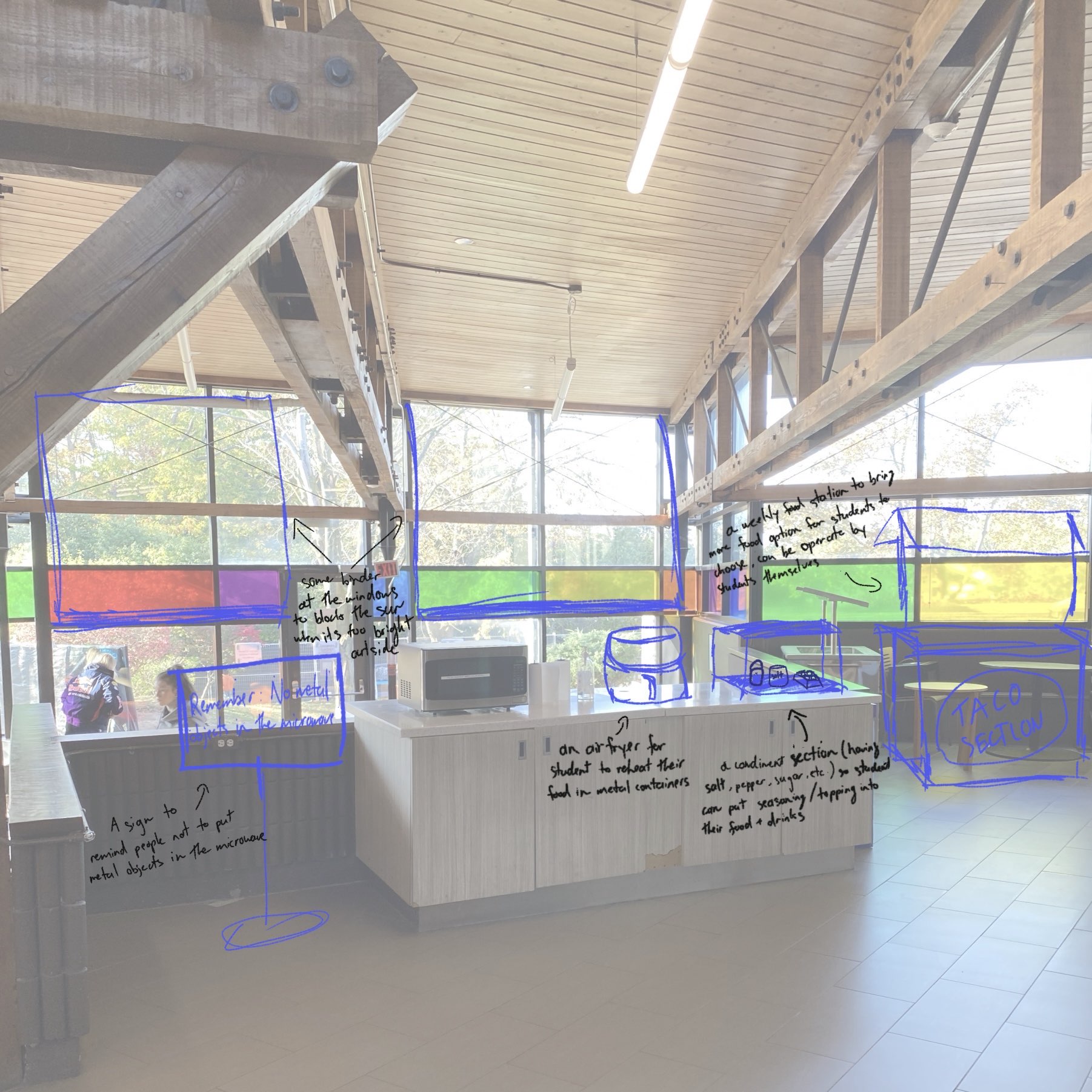
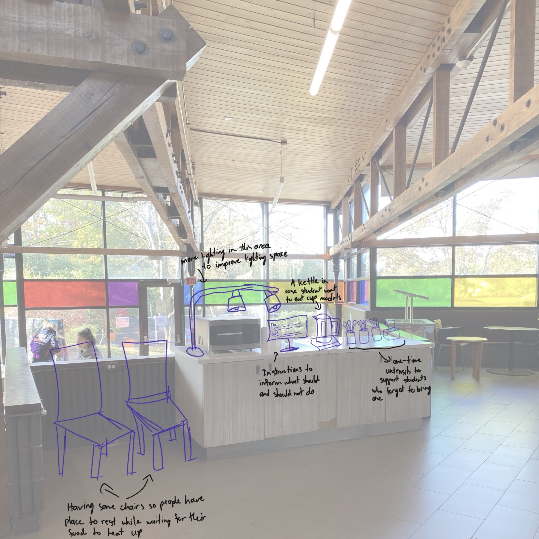
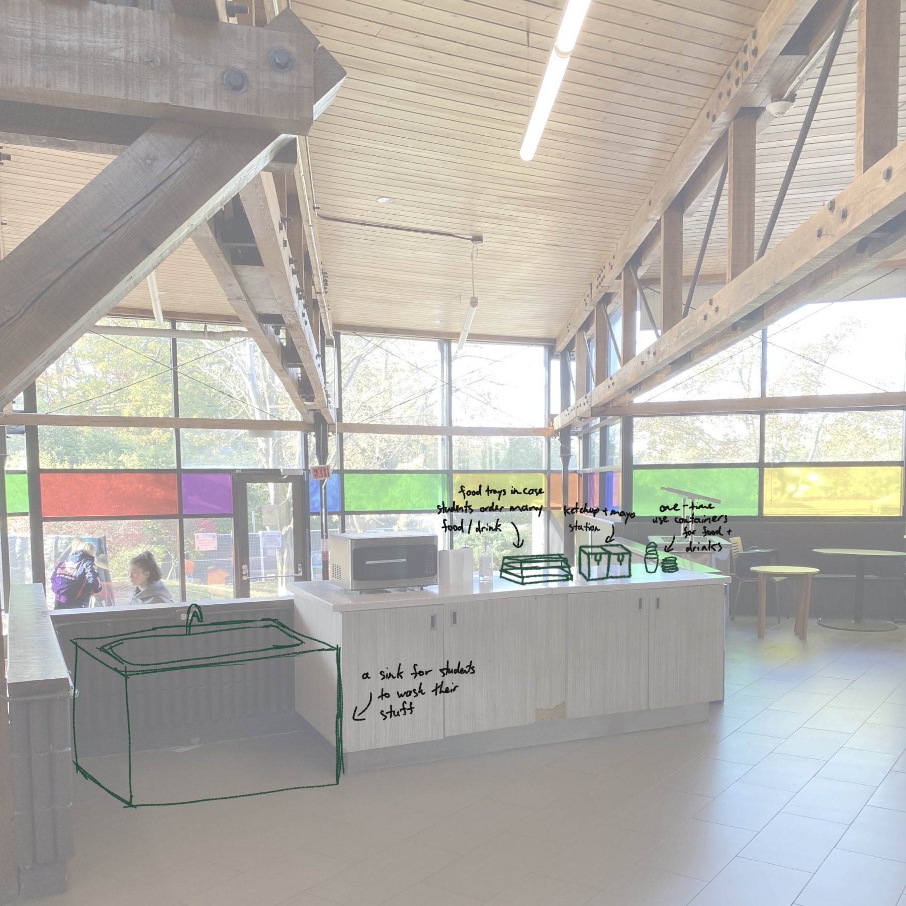
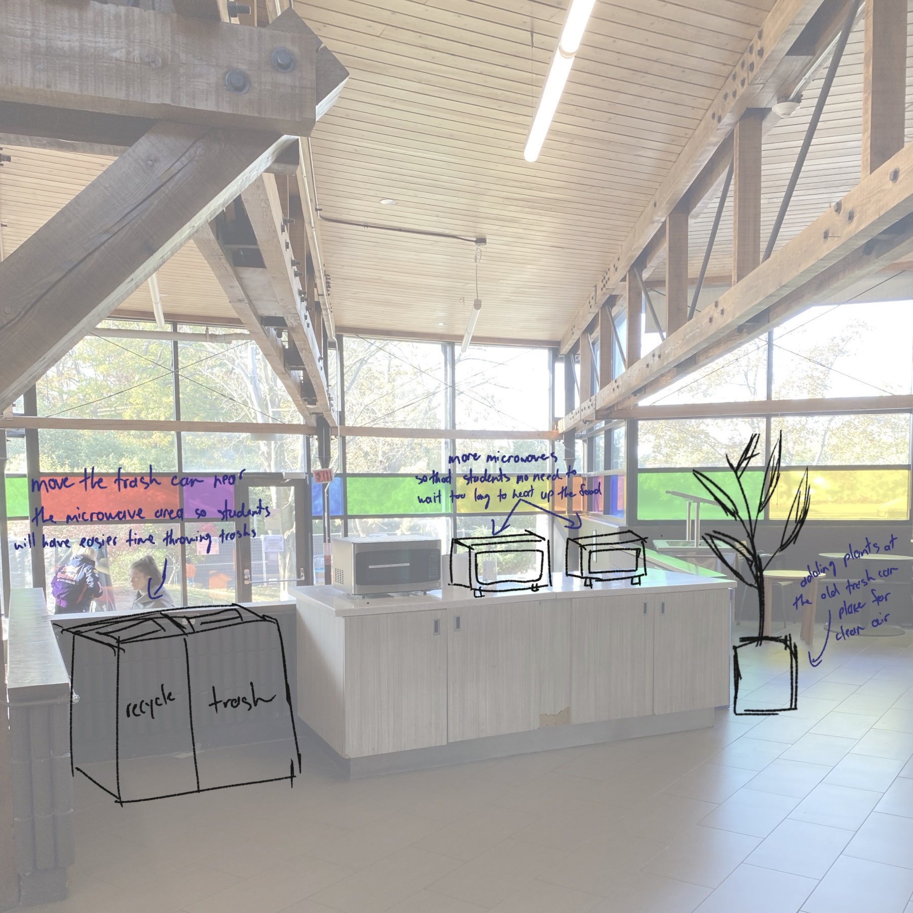
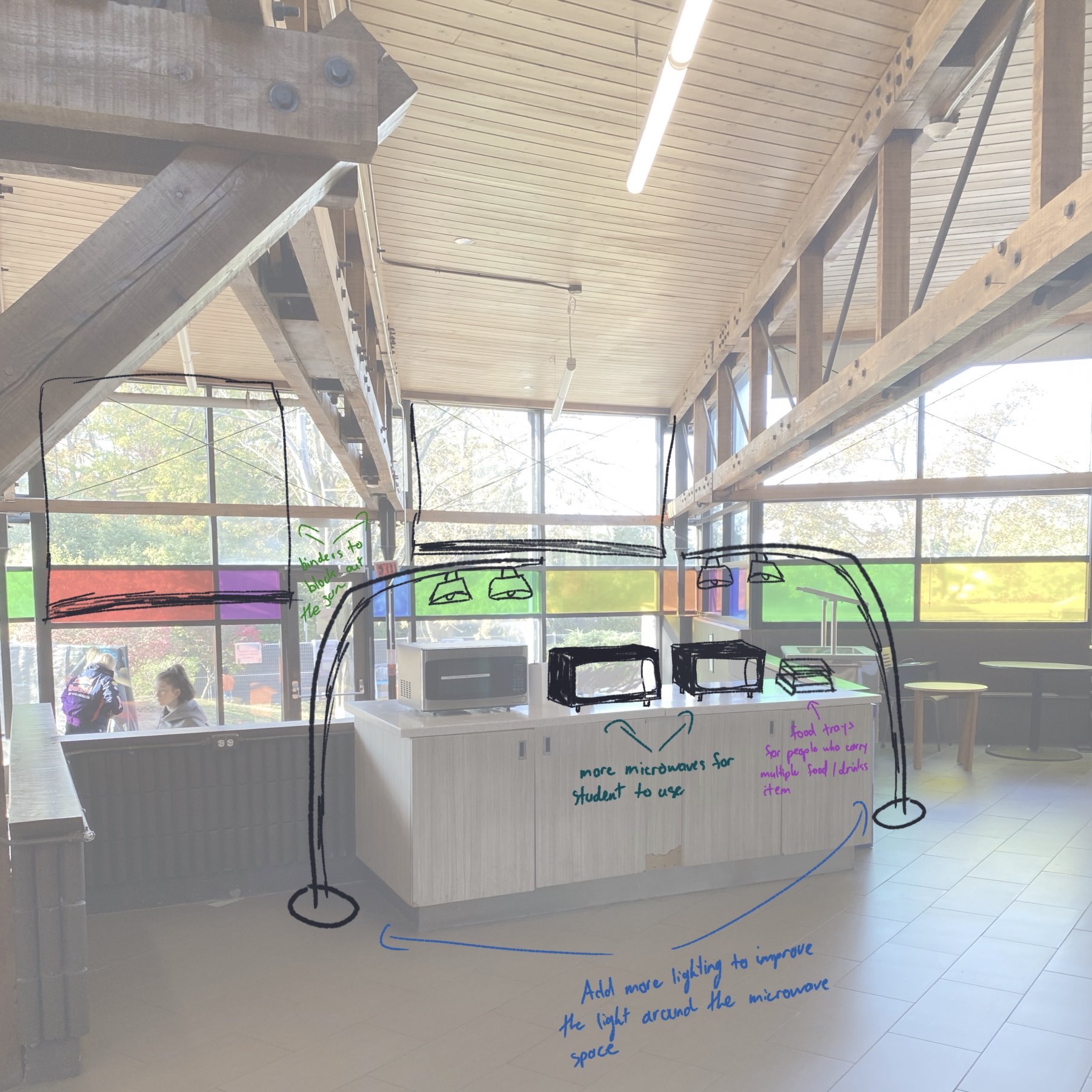
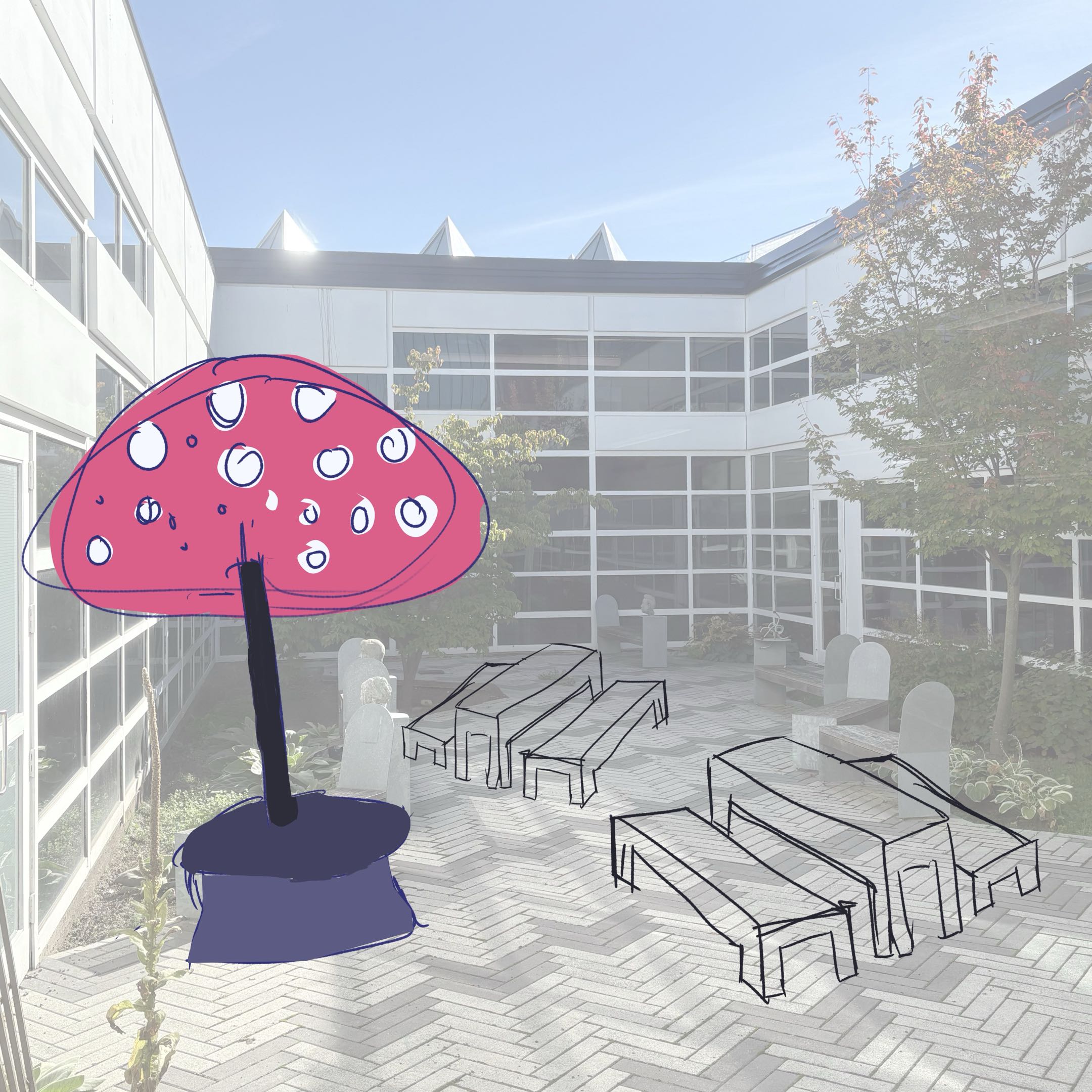
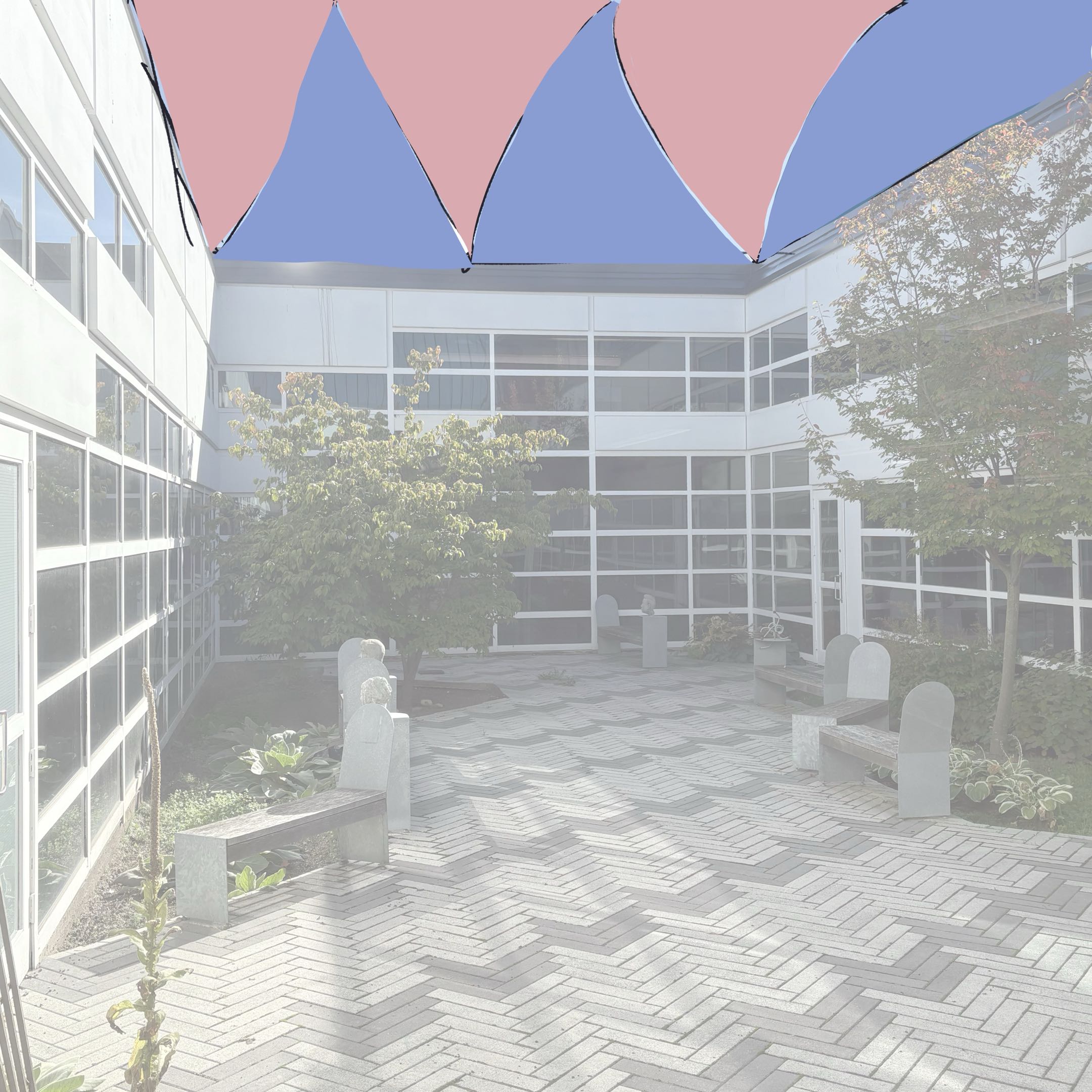
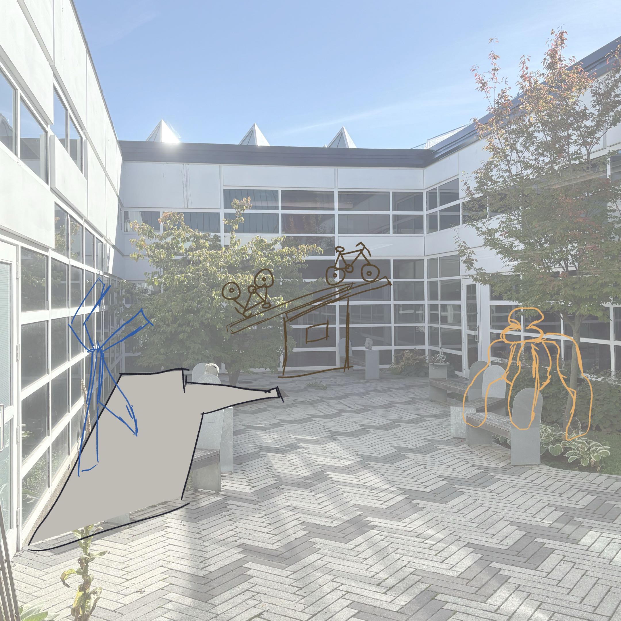
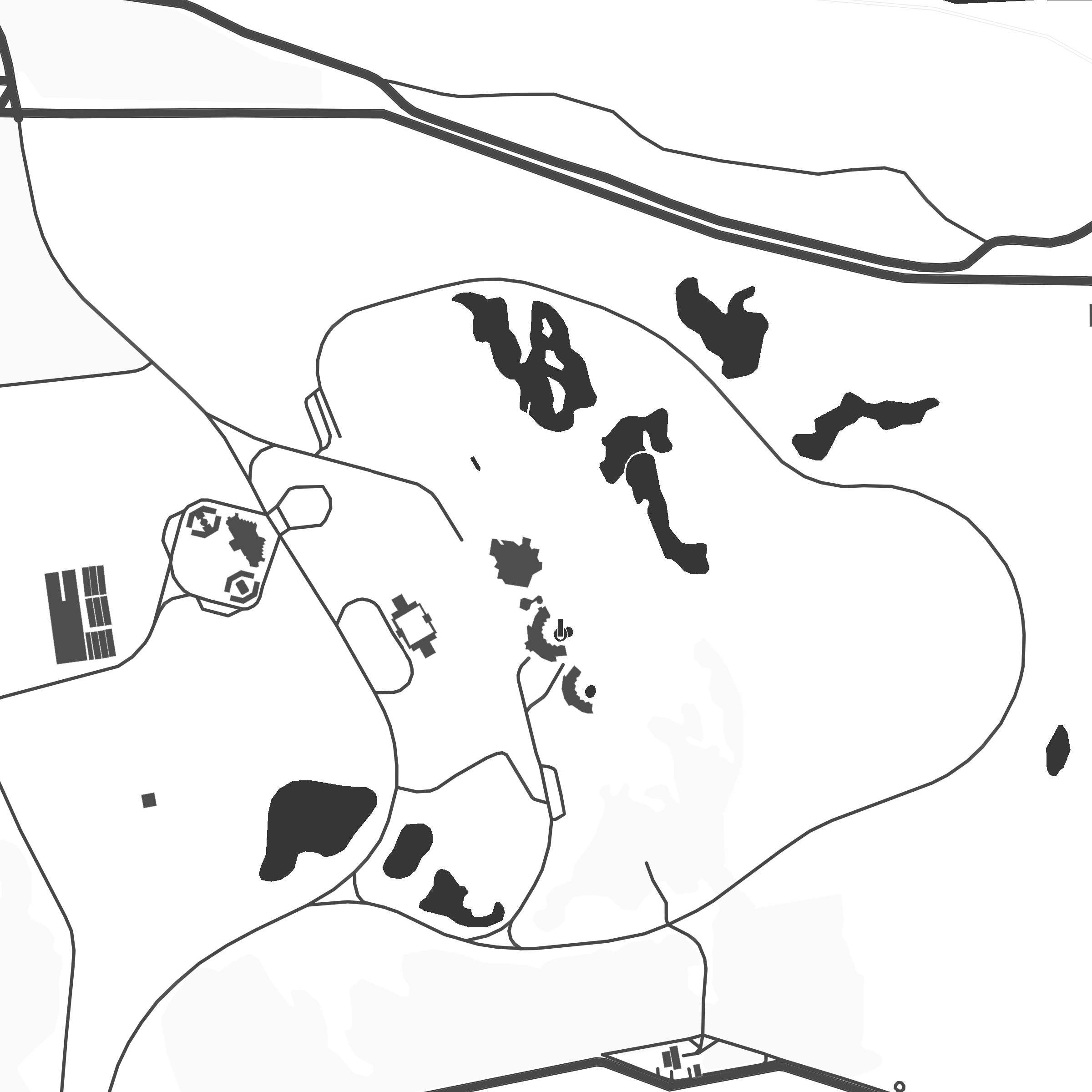
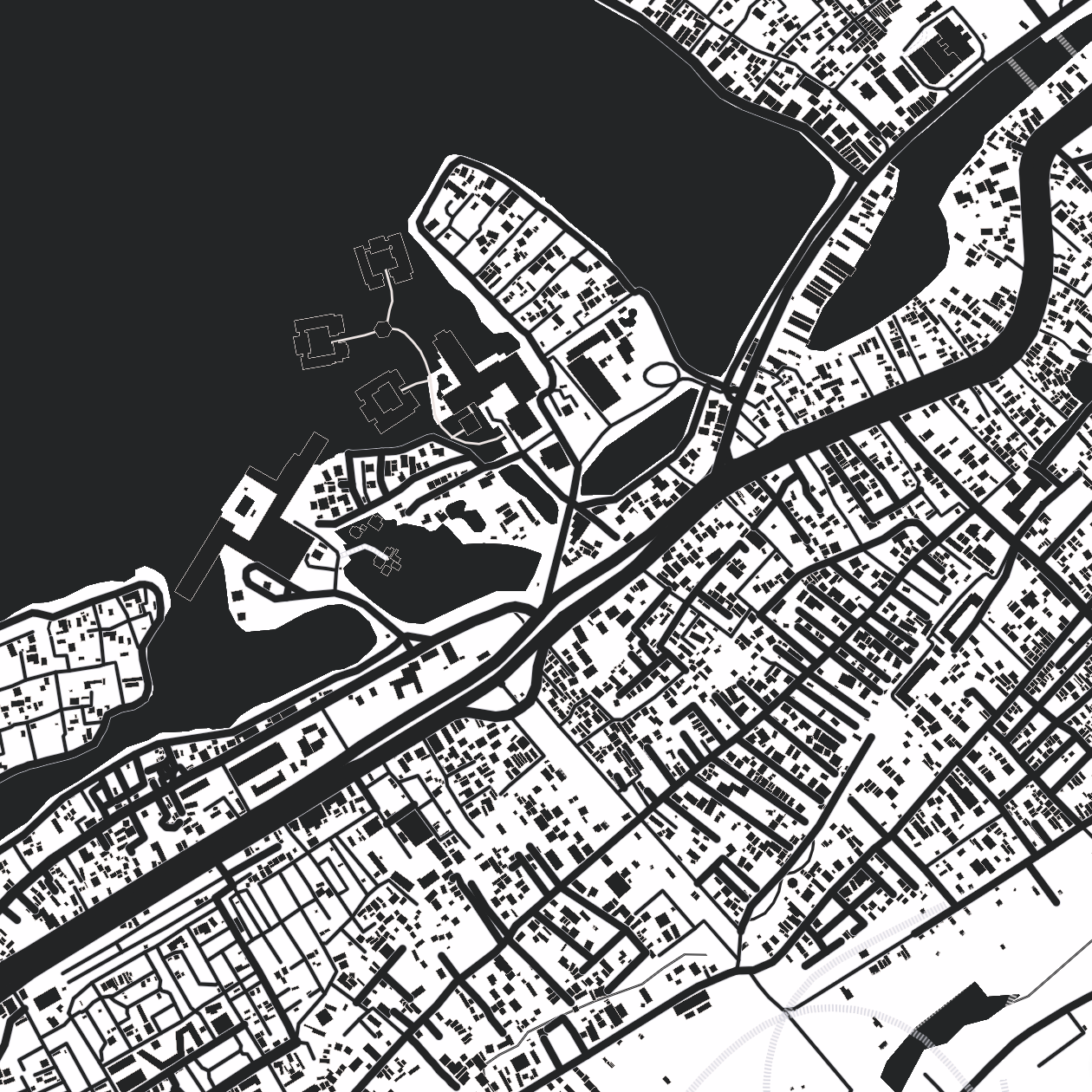
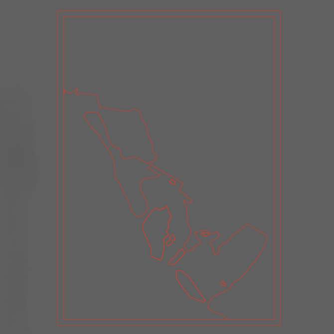
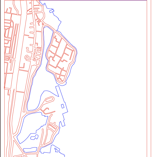
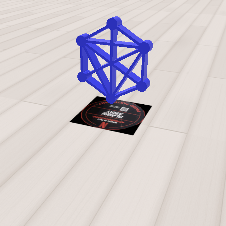
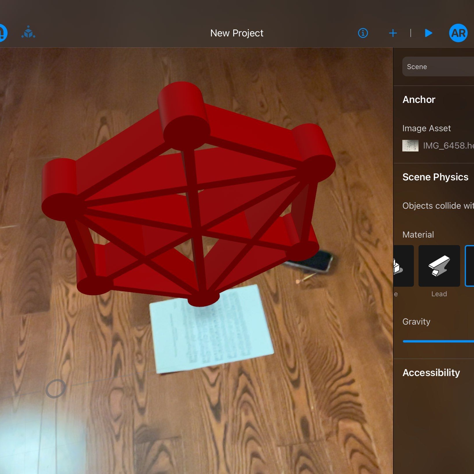
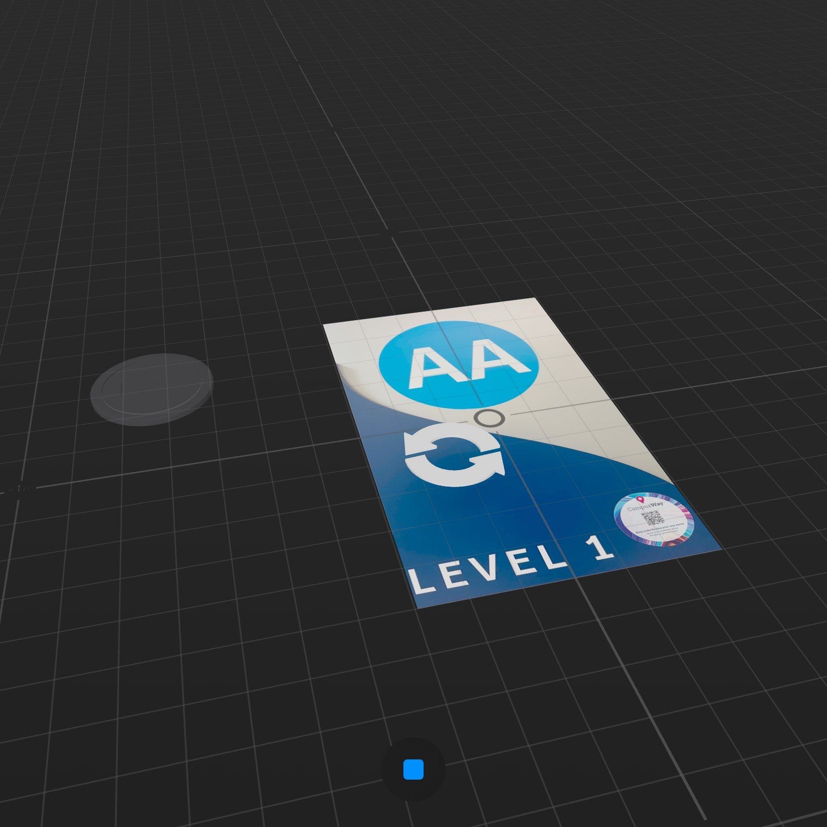
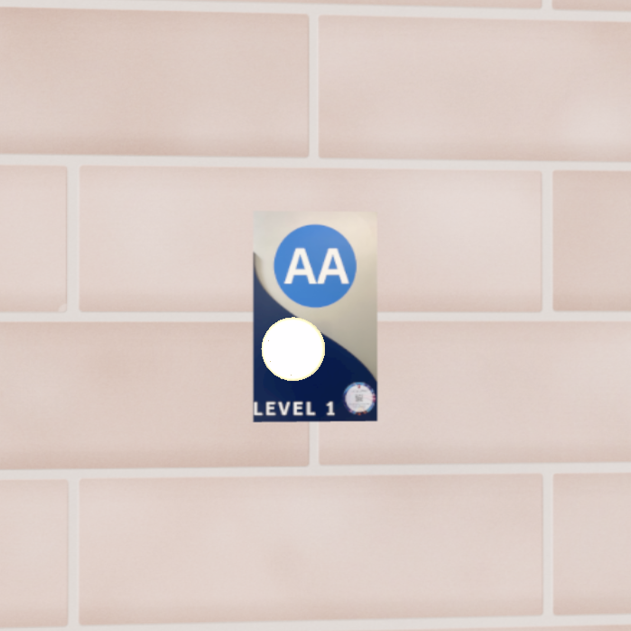
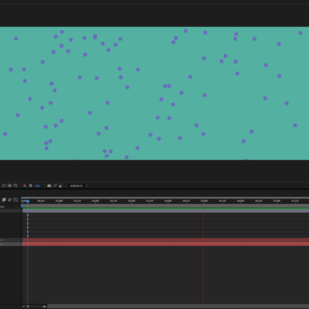
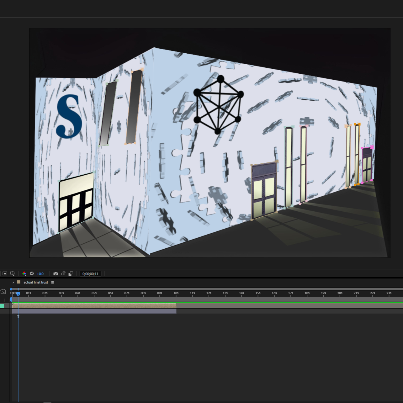
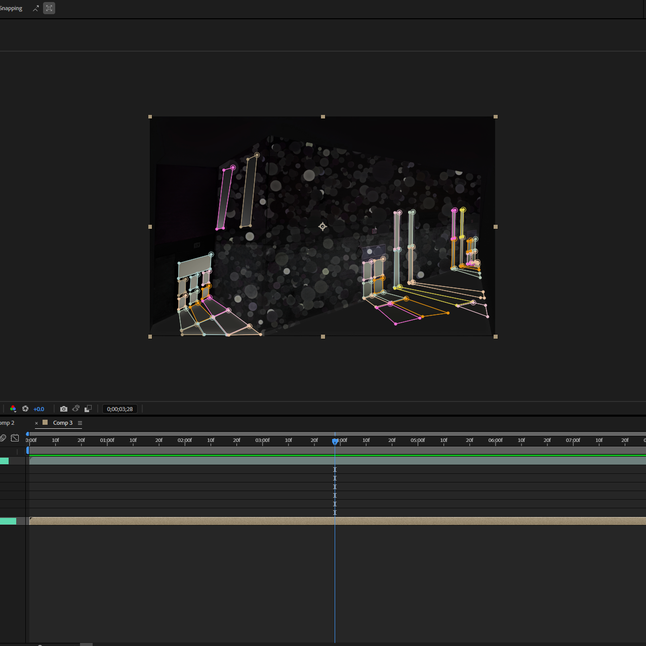
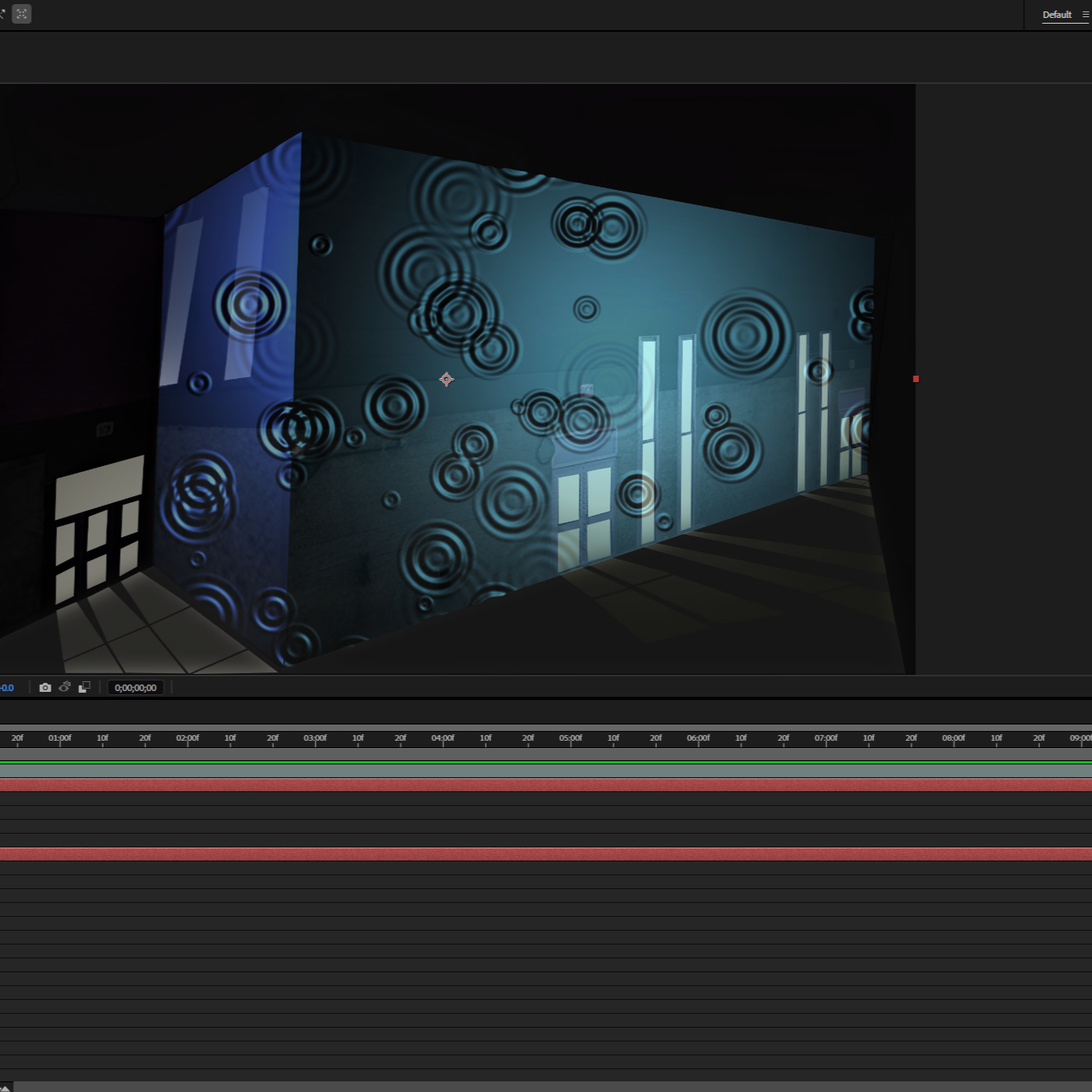
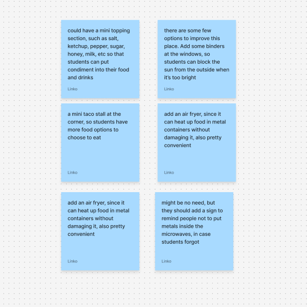
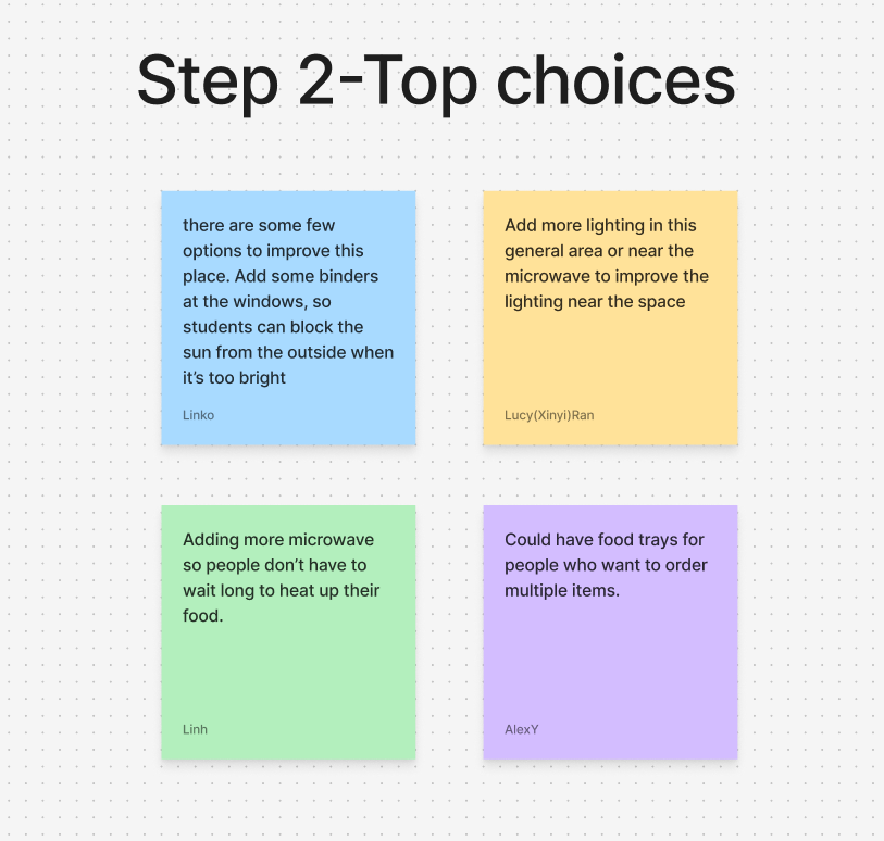
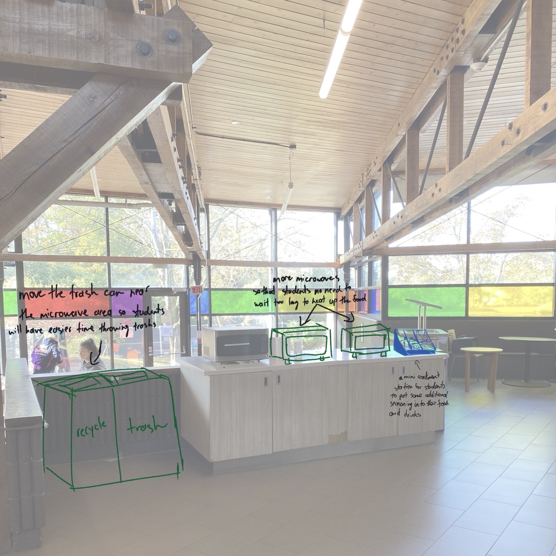
This is the canteen at Sheridan Trafalgar campus. It's a place where students and staff go to grab some food and drinks. This section of the canteen looks pretty plain, and I would like to improve it By adding a mini food stall, it will able to create a social interaction between people and staff. This also solve the problem of the abandone corner into a lively and positive space for food. The binders will help student don't get expose to the monkeys and birds too much, and also prevent glare from the sun. From the architectual theory, that structure will help humans having easier time interact with each other without being worry about sun and glare. My peer's suggestion. Having chairs there for people to rest when they're waiting food to heat up. The kettle is for students who having cup noodles, so they can have hot water to make their food. Having more lights within the space would also make it more special and gain attention for students, to know that's the place they can make their food  Still my peer's suggestion. Sometimes students want some condiments and dipping sause for their food, or sometimes that forgot to bring containers. By providing those near the microwave area, it will develop the convenience for students and make the space being more useful for them. The sink is also a nice idea, but it might encounter some safety hazard, with the microwave plug right near to it. In the architectural theory, the physical environments can influence humans' mood and emotions. In this improvements, by having additional microwave, people don't have to wait too long for the food to heat up. By having the trash can near the microwave area, people don't have to go far to dispose of their waste, making the space more convenient and user-friendly, which can lighten their mood. The combined idea from the team, integrating various improvements suggested by different members to create a more functional and aesthetically pleasing canteen space. Binders to help people prevent glare from the sun, additional light to highlight the space, additional microwaves to reduced waiting time for heating food, and trays for people carrying multiple foods. This is all to help improve people's communal and comfortable experience in the canteen Remember the sort of mini background that in the Animation building? Here are some improvemetns to make the place more interactive and engaging. Want a place to hangout? having tables and chairs for them. The design can be done by students or with students' idea. This able to improve students' thought and feeling regulators: more social interactions, lighten up their mood, and get some fresh air For providing shades and proection from bad weather, a canopy structure can be installed. It can also use for other activities, such as a projection where students can lie down and watch up above. Oh, speaking of that, maybe it can be a good place for star gazing too, since the canopy is retracable. Sheridan is mainly know for art, and we have student displays all around the campus, so how about make this as an outdoor exibitions too. By showing students' work, this can become a mini museum where peers can see each other work. It will also make the place more personalized for the students. And the exibition can be change bi-weekly to keep students visit by This design improvement is an example of biophilic design. Nature help people to being more calm and peaceful, so it'll be a greate place for relax. This will improve students a lot. From the architectural theory, this enviroment will able to boost up people metal well-being, mood, and social interaction. Imagine come by here at the dark. Too scary, isn't it? Providing lights that will able to attract more people to come, even if its's dark outside. Adding the lights support plants will be a two brids with one stone: mimic natural light for plants to grow, and providing lights for students. This enviroment will influence people's emotion, making it better. The floor tiles, is a bit plain, why don't add color and illustion to it?. Here's an example of that. This will bring more fun and interactive between students. The tiles can be a projection mapping or actual tiles, and can be design by students. These improments will encourage more interactions and communication toward others. Here's my section of exploring different idea for my final projects. The first thing I want to do is alterate the map based on a real-place on Earth and make it my own. My first time try to use Mapbox and Illustrator for laser cutting, soo I'm kinda messed up at first try. Still look good somehow, but it's unpritable. A screenshot from Mapbox of a street section in Hanoi. I edited it as monochrone so it will be useful for laser cutting... until I realized it's too many detailes. But it's a beutiful place, the place I visited a lot whem I'm still home. So many memories. Later on I reduced the size for the laser cutting, and divide the section into 4 parts, the lake, streets, houses and counter lines. Following the tutorial, I able to convert images into vector lines, and it was a success. Later one I edit the street layers, and realized it's a lot of details. I ended up have to delete many unnecessaries line because of that, and only leave things that important for me. The red line is the after, and the black one is the before Then, I tried to put the rive and the street line on. Looks very nice. But now I'm doing the reflection, some of the street lines can be cut down to make the design simpler. I'm surprised I actually nail it with a few attempts. Even though I'm pretty fixinated of doing laster cutting, I still want to see how the others idea able to do. Just follow the tutorial and try it out, it somehow work pretty well too I then tried on a different objects as the anchor and add some animation with in. It worked on the first time, but when I tried to adjust the animation, the app crashed, not once, not twice, but multiples times. Oh well, at least it works Using the AA wing sign, I tried to put an arrow and the coin from my previous project to test it out. The coin spinning was.. weird, it's going in circle instead of spining. For whatever reason I managed to screenshot right in that position. Pretty fun to do tho Since I'm doing this at home, I don't have the actual AA wing sige, so I just test it on the simulation. I made the coin animated and having some light setup, that's why the coin looks like a normal white circle. The final one is the projection mapping. Didn't know how it's gonna work so just playing around with the preset effects in After Effects. The first one I got is the jump dotted around, now I need to figure how to put in on the Sheridan building Tried with the SSU in Trafalgar campus. I want to make a break screen to pop out the Sheridan and IXD logo, but glass looks too common, so I go with puzzle pieces. This might able to make the SUU wall more interactive and immersive with students, just imagine the wall actually break- I discovred out more effects along the way. The gliter one is my favorite, it looks like stars, creating a fancy and romantic vibe. The only problem is that the waay I edited the effect made me a bit motion sickness due to the speed of each gliter. The final one is the drip effect. This one is more on the calm side, but still able to make it colorful and interactive if you know how to made it. Maybe by having a gradient instead of a solid color, it might improve the effect a lot...

Spatial Workshop 1
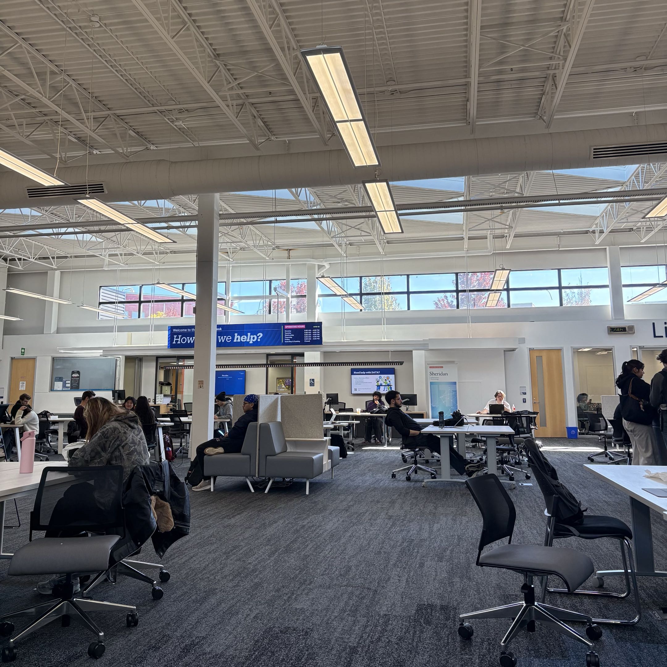
The learning commons is where students come to study, collaborate, and access various resources for their academic needs. However, that is not the only thing that the space offers. From the architectural theory, where a house and a home is two different things, one is a physical object that bring shelters for human, while the ladder provide a space of protection, comfort, and memories. The learning commons able to do both, as it's original fuctions and able a good place for students to hang out, create the sense of being along, connect with others, and build memories. My improvment of the outside walking path is to make it more accessible and user-friendly for students. Usually the walking path is create for people to pass by from one building to another, but I applied the architectual theory to make it more comfortable and a safety place for studenets by having lights and emergency features, in case there's something happen at night. The parking lot is a bit plain. My improvements is to make more fuctional besides just a parking lot. By applying the architectural theory, I aim to create a space that is not only practical but also contributes to the overall environment. It should be a space that serves multiple purposes and enhances the overall experience for users. In this case, by having a solar panel setup can not only provide shade for cars to park and keep it cool, but also generate renewable energy. This way, it more just a normal parking lot, it's now a mini electricity generation.

Spatial Workshop 2

My first few ideas to improve the cafeteria space. It might now be the best idea, but my peers also have very good idea, too. Here is the team's first idea for improving the cafeteria space. Each person have different perspective to improve the space. Some want to make the space more options and convenient for students, while others focus on comfort and efficiency. This is the drawing for the final three idea that the peers choose. The first one is having more microwaves available for students. This is because students often need to heat their food, so by having another one, it will same more time on waiting. The second one is creating a more comfortable seating arrangement. The third one is to add the condiment station for students to grab free stuff, from bag of tea or ketchup and mayo. From the architectural  theory, the cafeteria can be more than a place to grab food, it could be a place for people to heat up the food, to grab the stuff.

Project 2


Final Project 2 Design

Design name: Home and Community
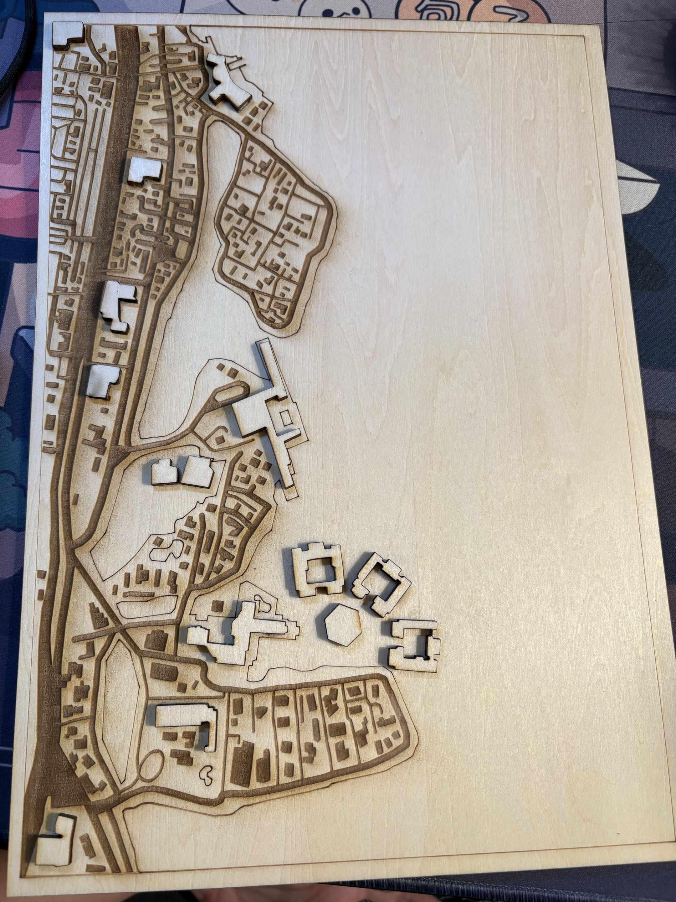
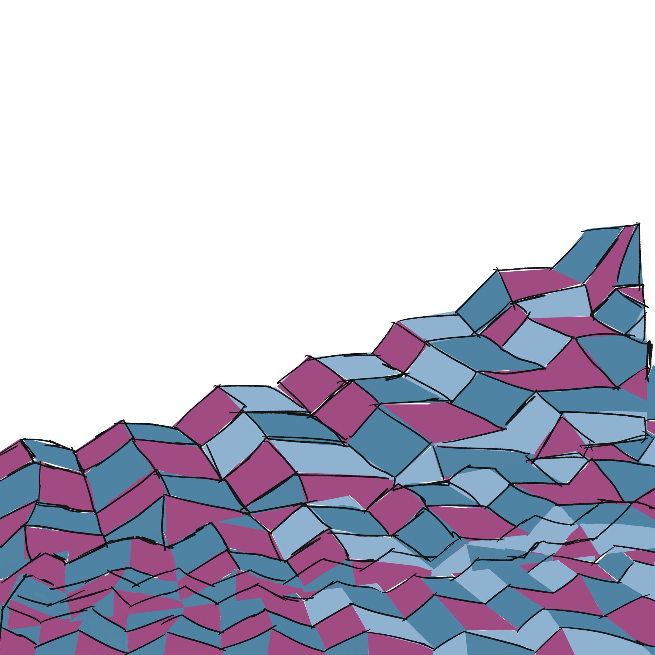
The final design map 'Home and Community' represent my memory of the place I used to grow up with, where I pass by to have fun with people I know. The streets and houses are always crowded with people butsling around, creating a lively and dynamic environment.
×

Powered by w3.css